FDAS Email Runbook
Private runbook. Enter hub password to continue.
That's not right. Try again.
FDAS Results Email: Stage 1 Runbook
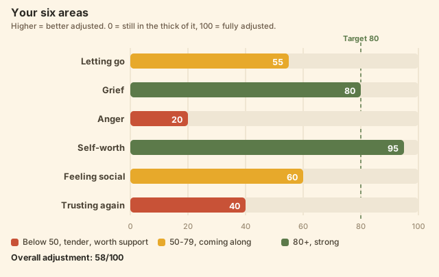
What this does: replaces the confusing self-test chart with a readable labeled bar chart, and swaps the generic "we understand this can be very challenging" paragraph for a one-tap personalized summary built from the taker's actual scores. The trick that keeps it safe: you don't rebuild any merge-field logic. You copy the values= string GoHighLevel already builds for the current chart and reuse it. It's an email-template edit only, nothing touches contacts, sending, or workflow logic.
Before you start (2 gates)
1. Bob signs off on the summary wording
The letter's actual sentences come from summary-content.md. That's the only content gate. Nothing else waits on Bob.
2. The worker URL is locked in
The chart and summary are generated by a small always-on worker, now deployed under a permanent name on your Cloudflare account. Throughout the steps below, this is the base URL:
https://rebuilding-fdas.annetteleethompson.workers.devConfirm both routes work before your session (they should return a chart and a summary):
The browser session
1Open the results email in GHL
Log in to GoHighLevel. Go to Automation → Workflows and open the workflow that fires after the self-test (the one with a "Send Email" step that delivers results). Open that email step in the builder.
Before touching anything, screenshot the whole template. That's your revert point.
2Find and copy the existing chart URL
The current email already has an image pulling the old chart. Click it and look at its image source. It contains a values= string built from merge fields, something like ...?values={{contact.disentanglement}},...,{{contact.overall}}. Copy that entire values=... portion. This is the working merge logic; you're reusing it, not recreating it.
The 7 values, in order, are Disentanglement, Grief, Anger, Self-Worth, Social Self-Worth, Social Trust, Overall. This already matches what GHL sends, so you never have to touch the field names.
3Swap in the readable chart
Replace that image's source with WORKER_URL/fdas.svg? followed by the values=... string you just copied. Same query string, new endpoint. Save. That one swap turns the confusing filled-line chart into the labeled bar chart with the Target-80 line and color-coded bands.
4Replace the generic paragraph with a personalized button
Delete the one-size-fits-all "we understand this time can be very challenging..." paragraph. In its place add a Button (GHL builder → add Button element) labeled "See your personalized results." Set its link to:
WORKER_URL/summary? + the same values=... string + &name={{contact.first_name}}That opens their personalized "what we see" summary, tailored to their own lowest and highest subtests, in Bob's approved wording.
5Save and send yourself a test
Use GHL's test-send, or run yourself through the quiz, and open the result on both desktop and phone. Confirm the new bar chart renders, the numbers match, and the button opens a summary that reflects the answers. A high-scoring test should read congratulatory, not distressed. That mislabeling is exactly the bug we're fixing.
Rollback
If anything looks off, GHL keeps prior template state. Revert the image source and the paragraph from your Step-1 screenshot. Nothing here touches contacts, workflow logic, or sending, so it's fully reversible.
What this version does and doesn't do
This ships the readable chart plus a personalized summary behind a button, with no provider API token and no workflow-logic change. The one thing it doesn't do is drop the summary text directly inline in the email body (GHL can't run the assembly logic in-template). Inlining it needs a small GHL workflow HTTP step, which is the Stage 2 upgrade that rides along with the API token from Bob's provider, and which also unlocks score-based follow-up (a warm track for high scorers, a gentler one for low scorers, so nobody gets silence).
Bottom line: a clean chart and a one-tap personalized summary is a big leap over today's generic letter, and it's live the same session Bob signs off on the wording.