🔑

SEO Believer Competitor Best Practices

Internal build reference. Enter hub password to continue.

That's not right. Try again.

🔑 Build Reference

Competitor Best Practices: 50 Sites Annette Flagged

Fifty screenshots you curated from competitor sites, each with notes on what works in the section and what works on the page. Use this as the design and conversion checklist while we build SEO Believer.

← Back to Hub
Recurring best practices to adopt

  1. A free, named lead magnet front and center. The strongest sites give the offer a real name and capture the email right inside the hero, so there is almost no friction between landing and signing up. We should put our free audit offer in the same spot.
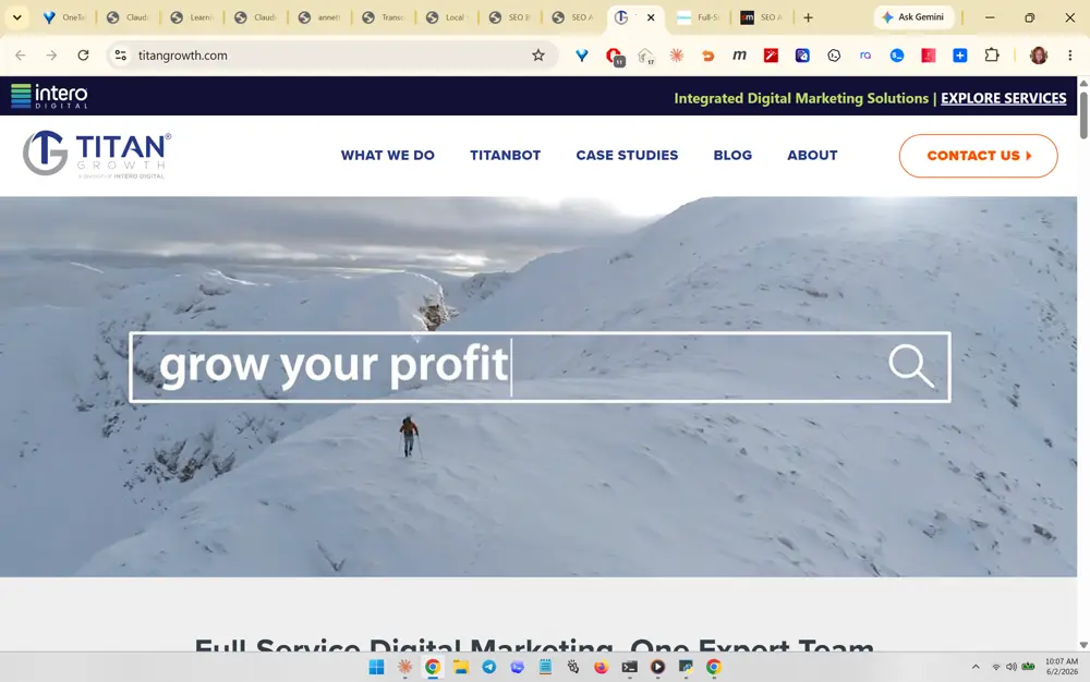
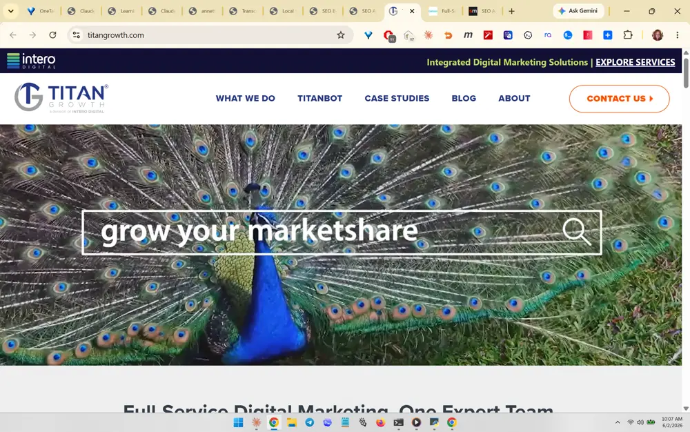
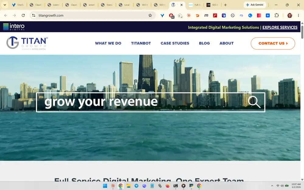
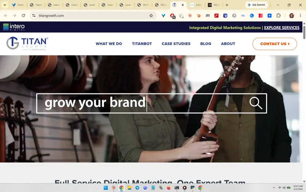
  2. Animated, benefit-driven heroes. Several sites use a search-box metaphor with benefit words rotating over video footage that matches each word, paired with one bold headline and a single call to action. The motion earns attention without adding copy.
  3. Proof-first, conversion-led design. Big stat numbers, star ratings with review counts, named case-study mockups, and real product screenshots do the selling. The proof leads and the pitch follows.
  4. Proof by content and borrowed authority. Walls of dated, read-time-stamped, category-tagged articles plus rows of tool and client logos and side-by-side comparison tables signal depth and credibility, even for a brand-new firm.
  5. Real faces build trust. Authentic human photography of the actual people, alongside independent review badges, reads as honest in a way stock imagery never does.
  6. The "search has changed" GEO hook. The sharpest sites open on the shift to AI search and position themselves as the answer, which is exactly the wedge our positioning is built on.
  7. Conversion psychology and transparency. A risk-reversal guarantee, an objection-handling FAQ accordion, transparent tiered pricing with the middle tier highlighted, and an inline booking calendar all lower the barrier to saying yes.

How the best ones move (and how to build it)

We captured the live motion on these sites and read what each one is actually built with. The pattern is clear, and it is good news for us. The premium feel does not come from a heavy framework. It comes from a handful of well-chosen techniques and careful CSS choreography. Here is the build plan I want our team to follow, and the parts I want us to leave on the shelf.

The headline insight: a hero background video is near-universal, on 15 of the 16 sites we could capture. Sliders are the single most common motion across the cohort, and they are the main thing we are missing right now. And the premium feel comes from CSS choreography, not from a heavy JavaScript library. Worth noting: Siege Media, our content gold standard, is deliberately low-motion. That is the reminder that motion is polish, not substance. The words and the proof do the selling. The motion just makes them feel considered.
  • HaveHero background video. A muted, autoplaying, looping clip behind the headline. We already run this on our site, and so does nearly everyone worth copying. It sets the tone the instant the page opens.
  • AddA CSS-only staggered "snap and settle" entrance. This is the A3 Brands approach, and it is the most quietly impressive thing in the whole set. Headline words, badges, and section blocks fade and lift into place on deliberately staggered delays, with a spring-like easing so they settle rather than just appear. A3 pulls off the most premium feel in the cohort with no heavy animation library at all, just authored keyframes. That is exactly right for a fast static site like ours.
  • HaveScroll-reveals. Sections that fade and slide in as you reach them. We already do this, and it remains the most common scroll device across the set.
  • HaveCount-up stat numbers. Proof figures that tick up from zero when they scroll into view, the way Titan Growth and the Found case study do it. We already have this, and it makes the numbers feel earned.
  • AddA Swiper testimonial and logo slider. This is the one real gap. A swipeable, auto-advancing carousel is the most common motion across every site we looked at, and we do not have it yet. Swiper is lightweight, well supported, and the right tool for rotating testimonials, client logos, and case-study cards without bloating the page.
  • OptionalA marquee proof-strip. A row of logos or proof points that scrolls horizontally on a loop. King Kong leans on these heavily for a never-still feel. It is pure CSS and cheap to add, so it is a nice-to-have once the essentials are in.
  • SkipKing Kong's bespoke WebGL globe and Wonderist's full GSAP ScrollSmoother suite. Both are genuinely gorgeous. Both are also heavy. Wonderist loads the entire premium GSAP toolkit plus smooth-scrolling, and King Kong renders a 3D globe in WebGL. Either one would slow down the very page we need AI to read quickly. We skip them on purpose.

Animation & how it's built, site by site

One row per site. What moves, what it's built with, and a quick verdict on whether it's worth building for us. Captured live on 2026-06-02 by reading each page's runtime libraries and motion hooks.

A3 BrandsBuild it
What moves
A choreographed, CSS-only entrance. Headline words and badges fade and lift on staggered delays, a status dot pulses, then sections snap in laterally and settle with a spring-like easing. A muted autoplay hero video loops behind it, with a marquee strip scrolling across. The feel is fast and physical, like everything snaps into place rather than just fading.
Built with
Next.js, pure Tailwind CSS keyframes and transitions with a custom ease-spring token. No GSAP, no Swiper, no jQuery.
For us
The model to copy. Premium motion with zero animation library, ideal for a static site. This is the "snap and settle" entrance in our playbook.
King KongCherry-pick
What moves
A silent autoplay hero video, then relentless horizontal motion: 28 marquee rows continuously scroll logos, awards, and review snippets. Lottie drives small looping icons, a WebGL canvas renders an interactive 3D globe, scroll-reveals ease blocks in, and a Swiper carousel rotates testimonials. High-energy and never still.
Built with
Custom JS front end. Swiper for the slider, Lottie for vector loops, a bespoke WebGL globe, and roughly 28 CSS marquees.
For us
Take the Swiper slider and the marquee strip. Skip the WebGL globe, it is gorgeous but heavy.
Titan Growth (Intero Digital)Build it
What moves
A silent autoplay hero video, then the standout: 30 number counters that count up from zero to their target as each stat block scrolls into view. Scroll-reveals ease content in and a couple of carousels rotate logos. Restrained and metric-led rather than flashy.
Built with
jQuery plus CSS for the count-ups and reveals. Generic carousels. No GSAP, no Lottie.
For us
All of it is buildable and on-brand. We already have count-up numbers and scroll-reveals, this confirms the recipe.
JEMSUCherry-pick
What moves
The most slider-driven page in the set: 22 Swiper carousels rotate testimonials, service cards, and logos. It adds 16 count-up stats, 11 parallax elements whose backgrounds drift at a different speed for depth, an ambient hero video that plays on view, and scroll-reveals.
Built with
WordPress. jQuery plus Swiper for the carousels. Counters and parallax are theme and CSS driven.
For us
Take the Swiper sliders and count-ups. Go easy on parallax, it can hurt performance and feel dated if overused.
FoundCherry-pick
What moves
A polished agency homepage built on reveal-on-scroll: 55 elements fade and slide in section by section. Five muted autoplay videos give the hero and feature blocks ambient movement, and five Slick carousels rotate logos, work, and testimonials. Smooth and premium. On its case-study pages, big result numbers count up from zero as each metric lands as its own beat.
Built with
WordPress. jQuery plus Slick carousel, with scroll-reveal and count-up logic in a custom bundle.
For us
The reveal-on-scroll rhythm and count-up case-study numbers are exactly our approach. We'd use Swiper rather than Slick.
Siege MediaSkip (by design)
What moves
Almost nothing, on purpose. A few elements fade in on scroll, one non-autoplaying video, and one small canvas drawing. No slider, no parallax, no marquee, no count-ups firing. The motion budget is intentionally tiny. It leans on typography and whitespace and uses motion as occasional punctuation.
Built with
WordPress, performance-tuned with WP Rocket. jQuery plus hand-rolled CSS. No animation library.
For us
The instructive counter-example. Our content gold standard is deliberately low-motion. Motion is polish, not substance.
Comrade Digital MarketingCherry-pick
What moves
Carousel-and-video heavy rather than scroll-choreographed. The page leans hard on Swiper, with auto-advancing sliders, logo and testimonial reels, and swipeable service carousels everywhere. Five muted autoplay videos supply ambient motion and a few marquee strips scroll content sideways.
Built with
WordPress with Bricks Builder. Swiper for every carousel plus native looping video and CSS marquees. No GSAP.
For us
This is the Swiper-everywhere proof point. Take the testimonial and logo sliders, just don't overdo the count.
Wonderist AgencySkip (too heavy)
What moves
The most sophisticated build by a wide margin. Buttery inertial smooth-scrolling, character-by-character headline reveals and scramble effects, line-drawing and shape-morphing SVGs, throwable physics interactions, typewriter text, 34 count-up numbers, and 10 looping videos. A continuously choreographed page where text assembles and SVGs draw as you scroll.
Built with
Webflow with the full premium GSAP suite: ScrollSmoother, ScrollTrigger, SplitText, ScrambleText, DrawSVG, MorphSVG, plus Lottie, Typed.js, and Swiper.
For us
Gorgeous, and far too heavy for a page we need AI to read fast. We borrow the count-ups (which we already have) and leave the GSAP suite alone.
Wolfgang DigitalCherry-pick
What moves
A hero background video plus a set of carousels, with a handful of scroll-reveals and a few marquee strips scrolling sideways. Smooth but not flashy.
Built with
Swiper for the sliders alongside GSAP and ScrollTrigger for the scroll work.
For us
Take the Swiper sliders and the hero video. We can get the same reveals from light CSS without pulling in GSAP.
Rock Salt MarketingBuild it
What moves
A muted autoplay hero video, a few count-up stat numbers, several carousels, and a handful of scroll-reveals. A tidy, conventional mix with nothing exotic.
Built with
jQuery plus the lightweight Splide slider. No GSAP or Lottie.
For us
Entirely buildable. Splide is a fine lightweight slider too, though we'll standardize on Swiper for consistency.
SEOtericBuild it
What moves
A hero background video, a few carousels rotating content, and a couple of scroll-reveals. Light and clean.
Built with
jQuery plus the lightweight Splide slider.
For us
Simple and buildable. Same recipe as ours: hero video, a slider, light reveals.
SEO WorksBuild it
What moves
The lightest-motion site of the set. A single muted autoplay hero video carries the page, with just a few fade-in elements and tasteful CSS hover transitions on buttons and cards. No carousels, parallax, or count-ups. Clean and fast.
Built with
WordPress, tuned with WP Rocket. Plain CSS transitions plus one HTML5 hero video. No animation library at all.
For us
Proof that one hero video plus clean CSS hovers can carry a whole page. A safe, fast baseline we already meet.
CartoozoSkip (dated)
What moves
The most dated build of the cohort. No animation framework at all. The only real motion is a couple of autoplaying looping background videos in the hero. Otherwise the page is mostly static aside from standard hover effects.
Built with
A legacy 2018-era custom WordPress theme. jQuery plus CSS only.
For us
The "do not copy" baseline. The one thing worth keeping, a hero video, we already have.
YoutechCould not capture
What moves
Not captured. The site returned an SSL certificate error (expired or invalid certificate) during the crawl, so the page would not load for analysis.
Built with
Unknown, capture failed.
For us
Worth a manual revisit once their certificate is fixed. An expired cert is itself a trust and SEO red flag.
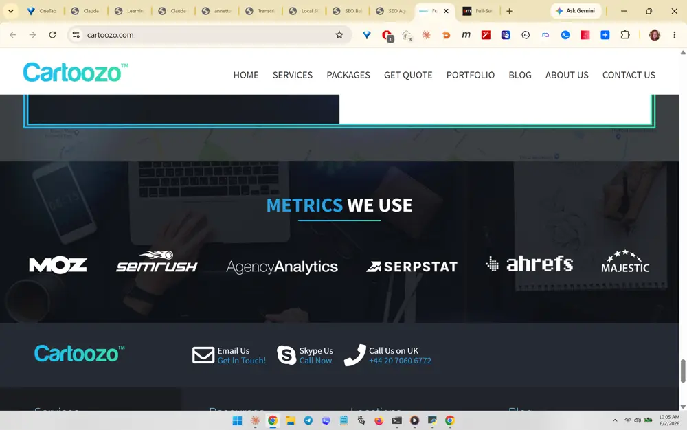
Cartoozo screenshot 366
#366 Cartoozo
What you like about this section

The highlighted strip is a 'Metrics We Use' logo bar showing the industry tools she works in: Moz, SEMrush, Agency Analytics, Serpstat, Ahrefs, Majestic. The transferable best practice is a borrowed-credibility tool/logo row that signals competence-by-association without needing client logos, which is ideal for a brand-new consultancy. Keep it on a single muted band with grayscale-to-color logos so it reads as 'I work in the real tools' rather than as paid endorsements.

What you like about this page

Clean white nav over a dark proof band creates strong contrast and a clear visual rhythm, and the footer packs Email/Skype/Call contact options into compact icon+label trust cues.

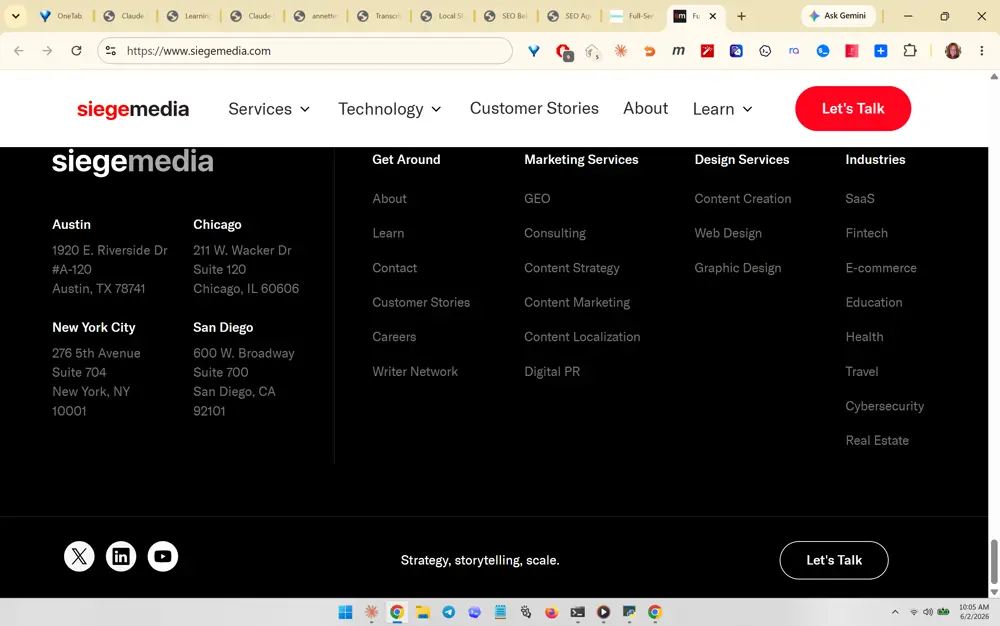
Siege Media screenshot 367
#367 Siege Media
What you like about this section

The cropped element is a wide multi-column 'mega footer' sitemap that groups links into Get Around, Marketing Services (GEO, Consulting, Content Strategy), Design Services, and Industries. The transferable practice is using the footer as an SEO and navigation asset: it surfaces every service and industry page for internal linking and crawlability while reassuring humans the firm covers their niche. Note the explicit 'GEO' service link, which mirrors her AI-search positioning.

What you like about this page

Restrained palette (cream, black, one red accent), generous whitespace, and a repeated 'Let's Talk' CTA give a premium, confident agency feel with a single clear conversion action.

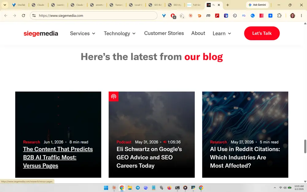
Siege Media screenshot 368
#368 Siege Media
What you like about this section

Highlighted is the 'Here's the latest from our blog' section rendered as three large image cards, each tagged by content type (Research, Podcast), date, and read-time. The transferable best practice is dated, categorized, read-time-stamped article cards: these freshness and authorship signals help both human trust and AI citation, and the type tags (Research/Podcast) advertise content depth. Recent 2026 dates signal the site is actively maintained.

What you like about this page

Bold centered section header with a color-accented keyword, then a balanced 3-up grid, makes the latest content feel current, credible, and easy to scan.

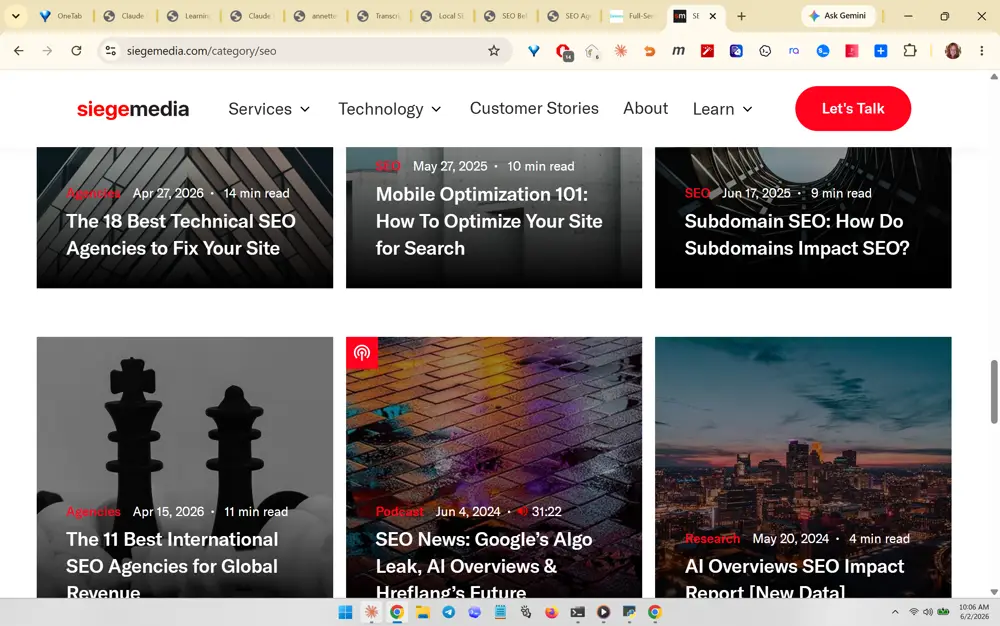
Siege Media screenshot 369
#369 Siege Media
What you like about this section

This is the blog/category archive grid (SEO category) showing a dense, consistent gallery of image-led post cards with category tag, date, and read-time on every tile. The transferable practice is a content-library wall that visually demonstrates topical authority and publishing cadence at a glance, with consistent card anatomy (image + tag + date + title + minutes). The sheer volume plus recency communicates 'this is a serious, prolific expert source' to readers and AI crawlers alike.

What you like about this page

Uniform card sizing and typographic hierarchy make a large content catalog feel organized and authoritative rather than cluttered.

Titan Growth (Intero Digital) screenshot 370
#370 Titan Growth (Intero Digital)
What you like about this section

The cropped hero shows a full-bleed background video (snowy mountain climber) with a giant fake 'search box' headline reading 'grow your profit' and a magnifying-glass icon. The transferable best practice is the search-bar hero metaphor: framing the value proposition as a literal Google search box ties the brand instantly to SEO and lets the headline 'autocomplete' through rotating benefit words. The cinematic background video adds motion and emotional lift behind a very simple, on-message overlay.

What you like about this page

Light top nav over an immersive video hero with one strong metaphor keeps the message focused while feeling high-production and modern.

Titan Growth (Intero Digital) screenshot 371
#371 Titan Growth (Intero Digital)
What you like about this section

Same search-box hero, here cycling to 'grow your marketshare' over a vivid peacock background video. The highlighted feature is the rotating-word animation inside the search bar (profit / marketshare / revenue / brand / leads), each paired with a thematically matched background clip. The transferable practice is an animated typewriter/rotator headline that lets one hero promise multiple outcomes, broadening appeal without adding copy and giving a reason to keep watching.

What you like about this page

The striking, color-rich video backgrounds plus a consistent overlay create memorable, scroll-stopping branding while the message stays singular and clear.

Titan Growth (Intero Digital) screenshot 372
#372 Titan Growth (Intero Digital)
What you like about this section

Same hero rotating to 'grow your revenue' over a city-skyline-and-water video. This confirms the pattern: a fixed search-box frame with a swapping benefit noun and a matching cinematic backdrop per word. The transferable best practice is pairing each rotating benefit with its own evocative footage so the motion feels intentional and editorial rather than gimmicky, reinforcing each business outcome with a distinct visual mood.

What you like about this page

Consistent layout across rotations means the brand reads as polished and deliberate; the eye stays on the headline because only the words and backdrop change.

Titan Growth (Intero Digital) screenshot 373
#373 Titan Growth (Intero Digital)
What you like about this section

Same search-box hero rotating to 'grow your brand' over warm, human footage of people in a guitar shop. The notable detail here is the use of relatable small-business/human imagery for the 'brand' promise, versus abstract scenery for the financial promises. The transferable practice is matching footage emotional register to the specific benefit word: human warmth for brand, grand vistas for growth, so each frame sells a different buyer motivation.

What you like about this page

Humanized video imagery makes an otherwise corporate SEO pitch feel approachable and relevant to real owner-operators.

Titan Growth (Intero Digital) screenshot 374
#374 Titan Growth (Intero Digital)
What you like about this section

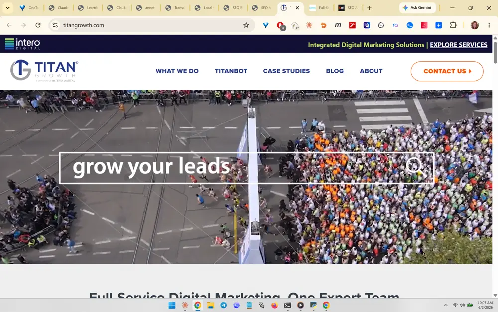
Final hero rotation, 'grow your leads', over an aerial marathon/crowd video that visually equates 'leads' with a flood of people. The transferable best practice is literal visual metaphor: a crowd to mean leads, money/skyline to mean revenue, so the background does semantic work, not just decoration. Pairing the most conversion-relevant word ('leads') with the densest crowd shot is a smart emphasis choice for a lead-gen pitch.

What you like about this page

The full set demonstrates a repeatable, low-text hero system any solo consultant could replicate with a handful of stock clips and a CSS word rotator.

Titan Growth (Intero Digital) screenshot 375
#375 Titan Growth (Intero Digital)
What you like about this section

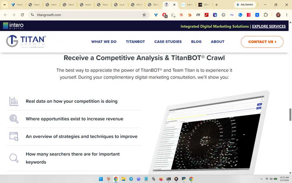
Scrolled-down section: 'Receive a Competitive Analysis & TitanBOT Crawl' offer, an icon+benefit list (real data on competitors, where revenue opportunities exist, strategies to improve, keyword search volume) beside a laptop mockup showing a crawl visualization. The transferable best practice is a free, tool-branded audit lead magnet presented as a scannable benefit list with a product screenshot, which converts visitors by promising concrete, specific deliverables. This maps directly to her planned free SEO audit offer.

What you like about this page

Centered intro copy, a clean 4-item value list, and a supporting product visual make a compelling, low-friction conversion section that turns curiosity into a consult booking.

Titan Growth (Intero Digital) screenshot 376
#376 Titan Growth (Intero Digital)
What you like about this section

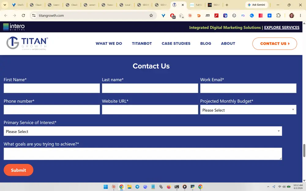
The highlighted element is the multi-field 'Contact Us' qualification form laid out as a clean three-column grid (First Name, Last Name, Work Email / Phone, Website URL, Projected Monthly Budget / Primary Service of Interest / goals). The transferable best practice is a structured lead-qualification form that captures budget and service interest up front so unqualified prospects self-filter, presented full-width on a bold colored background so it reads as the page's main conversion moment rather than a buried footer form. Note the 'Projected Monthly Budget' dropdown, which is exactly the tire-kicker filter Annette's brief calls for.

What you like about this page

A focused, single-purpose contact page with a confident dark-blue conversion block and clear sticky 'CONTACT US' nav CTA, so visitors always know the next step.

Titan Growth (Intero Digital) screenshot 377
#377 Titan Growth (Intero Digital)
What you like about this section

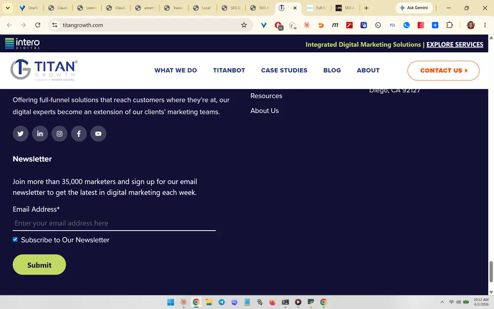
The highlighted section is the footer newsletter capture with the social-proof line 'Join more than 35,000 marketers and sign up for our email newsletter.' The transferable best practice is pairing the email signup field with a quantified credibility number plus a pre-checked subscribe option and a single colored 'Submit' button, turning a normally-ignored footer into a low-friction list-building moment. Social-proof-anchored email capture is reusable for SEO Believer's audit lead magnet.

What you like about this page

A tidy footer with grouped link columns, social icons, and the newsletter block, keeping the page useful all the way to the bottom.

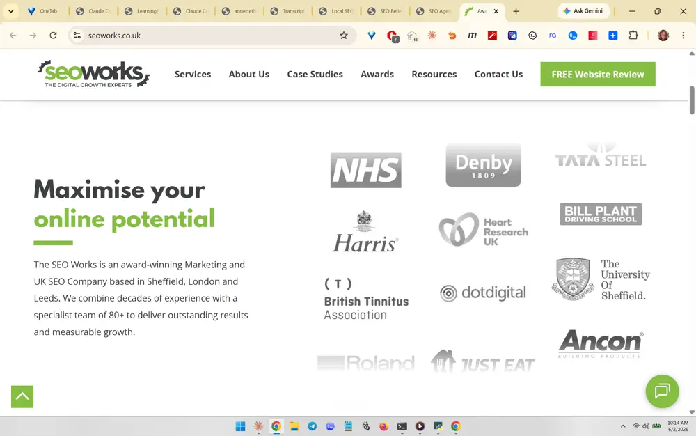
SEO Works (seoworks.co.uk) screenshot 378
#378 SEO Works (seoworks.co.uk)
What you like about this section

The cropped focus is the client logo wall (NHS, Denby, Tata Steel, University of Sheffield, Just Eat, etc.) sitting immediately beside the 'Maximise your online potential' hero copy. The transferable best practice is placing recognizable brand logos right next to the value proposition so authority is borrowed in the first screen, before any scrolling. For SEO Believer this maps to a Bone Voyage / Rebuilding Seminars / credential strip near the hero.

What you like about this page

Clean above-the-fold split layout: concise benefit headline with an accent-colored keyword on the left, trust logos on the right, and a green 'FREE Website Review' CTA in the nav.

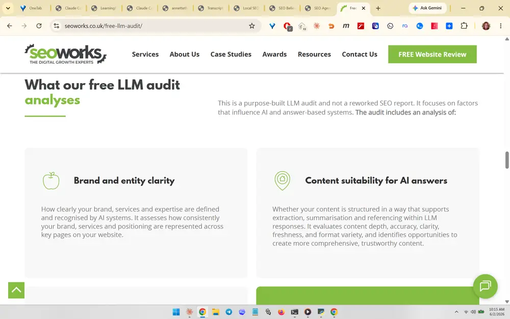
SEO Works (seoworks.co.uk) screenshot 379
#379 SEO Works (seoworks.co.uk)
What you like about this section

The highlighted feature is the 'What our free LLM audit analyses' section with two icon-topped cards: 'Brand and entity clarity' and 'Content suitability for AI answers.' The transferable best practice is productizing a free AI/LLM audit as a distinct, named offer (explicitly not a reworked SEO report) and explaining what it evaluates in plain card copy. This is directly on-strategy for SEO Believer's GEO positioning and free-audit lead magnet.

What you like about this page

A reassuring two-card explainer with soft gray panels and line icons that makes a technical AI-audit offer feel concrete and approachable.

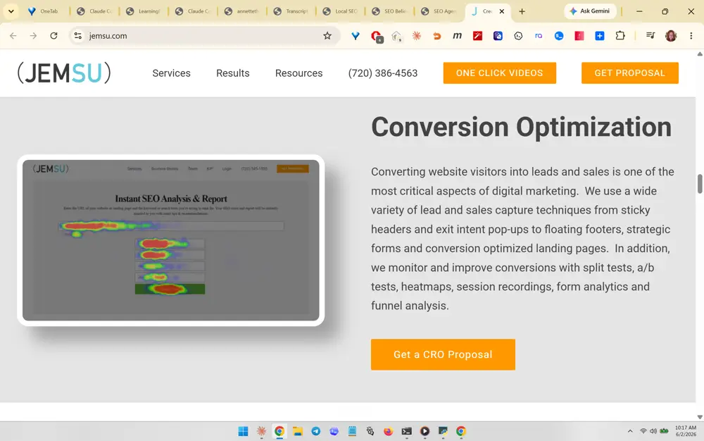
JEMSU (jemsu.com) screenshot 380
#380 JEMSU (jemsu.com)
What you like about this section

The highlighted element is the framed heatmap product screenshot ('Instant SEO Analysis & Report') paired with the 'Conversion Optimization' copy describing CRO tactics. The transferable best practice is showing a real tool/report screenshot (a colorful heatmap) beside the service description so the abstract service becomes visually tangible, plus a single orange 'Get a CRO Proposal' CTA. Product-screenshot-as-proof is reusable for SEO Believer's audit deliverables.

What you like about this page

A clean text-plus-visual service row with strong heading, scannable benefit paragraph, and one obvious orange CTA against white space.

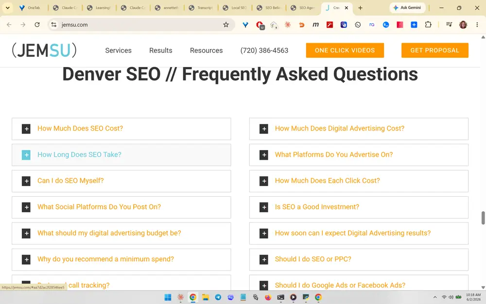
JEMSU (jemsu.com) screenshot 381
#381 JEMSU (jemsu.com)
What you like about this section

The highlighted section is the 'Denver SEO // Frequently Asked Questions' accordion laid out in two columns of expandable plus-button rows (How Much Does SEO Cost, How Long Does SEO Take, Is SEO a Good Investment, etc.). The transferable best practice is a geo-named, two-column FAQ accordion that answers buyer-intent and pricing questions directly, which doubles as FAQPage schema fuel for AI citation. Maps perfectly to SEO Believer's Boulder/Denver location-page FAQ blocks.

What you like about this page

A scannable, space-efficient FAQ page where the city-prefixed heading signals local relevance and the accordion keeps a long question list tidy.

JEMSU (jemsu.com) screenshot 382
#382 JEMSU (jemsu.com)
What you like about this section

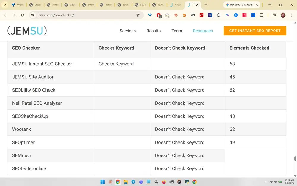
The highlighted element is the competitive comparison table on the SEO Checker page, ranking JEMSU's tool against rivals (SEMrush, Woorank, Neil Patel, SEOptimizer) by 'Checks Keyword' vs 'Doesn't Check Keyword' and number of 'Elements Checked.' The transferable best practice is a head-to-head comparison table that frames your tool/service as the only one doing the key thing, which reads as objective and is highly extractable by AI answer engines. Reusable as a 'why SEO Believer vs other consultants' table.

What you like about this page

A clean, data-forward table page that builds authority through structured comparison rather than claims, easy for both skimmers and AI crawlers to parse.

JEMSU (jemsu.com) screenshot 383
#383 JEMSU (jemsu.com)
What you like about this section

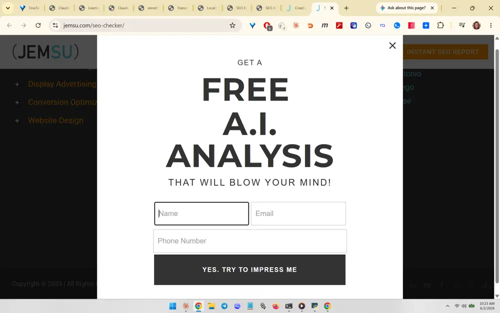
The highlighted feature is the exit/entry pop-up modal: bold 'FREE A.I. ANALYSIS THAT WILL BLOW YOUR MIND!' with a compact Name/Email/Phone form and a personality-driven dark button reading 'YES, TRY TO IMPRESS ME.' The transferable best practice is a high-contrast lead-capture modal whose CTA copy has voice and dares the visitor, lifting opt-ins versus a generic 'Submit.' The free-AI-analysis hook again aligns with SEO Believer's GEO offer.

What you like about this page

A focused modal that dims the page behind it, keeps the form to three fields, and uses confident, on-brand button copy to drive signups.

Found (found.co.uk) screenshot 384
#384 Found (found.co.uk)
What you like about this section

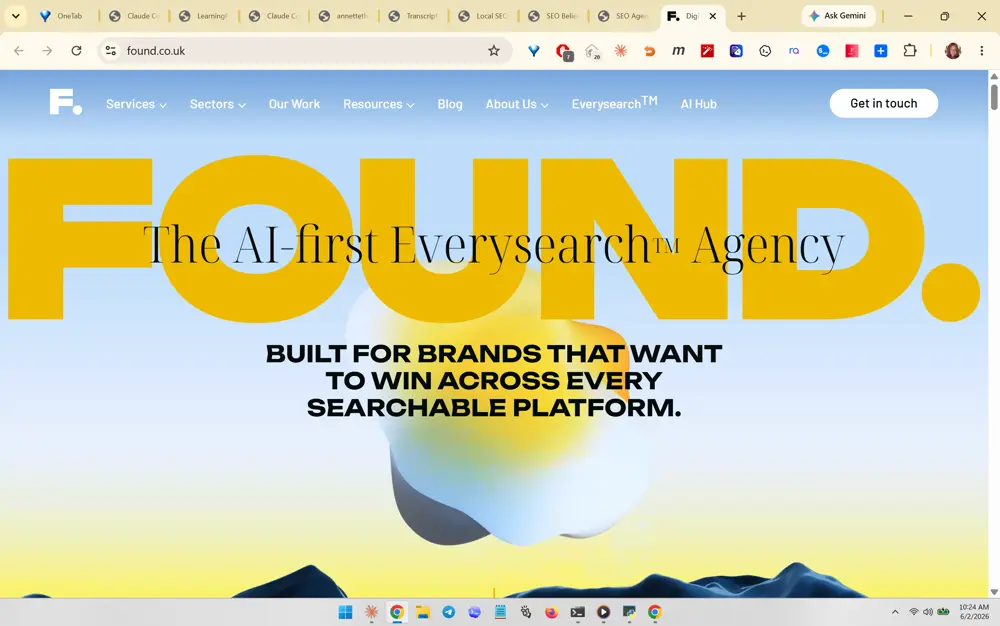
The cropped focus is the hero: a giant typographic 'FOUND.' lockup with the serif tagline 'The AI-first Everysearch Agency' overlaid, sitting on a soft, light gradient/3D background (the kind of hero video/animated background Annette likes). The transferable best practice is an oversized brand-word hero plus a one-line category-defining positioning statement over a bright, airy animated background, paired with bold all-caps supporting copy. The light, cheerful palette fits Annette's no-dark-backgrounds rule.

What you like about this page

A striking, modern hero that leads with brand confidence and a memorable positioning phrase, light and bright with a soft pastel gradient behind 3D shapes.

Found (found.co.uk) screenshot 385
#385 Found (found.co.uk)
What you like about this section

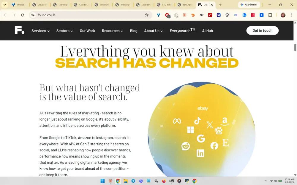
The highlighted section is the 'Everything you knew about SEARCH HAS CHANGED / But what hasn't changed is the value of search' narrative block, with explanatory copy beside a 3D sphere studded with platform logos (Google, TikTok, Amazon, Instagram, X, LinkedIn, ChatGPT, etc.). The transferable best practice is a problem-framing storytelling section that uses big mixed-weight typography and a single illustrative graphic to dramatize the SEO-to-AI-search shift, then ties it back to the agency's value. The multi-platform sphere is a strong visual metaphor for 'search is everywhere now.'

What you like about this page

An editorial, scroll-stopping section that mixes elegant serif and bold accent type with one memorable 3D graphic, making a strategic message feel premium.

Found (found.co.uk) screenshot 386
#386 Found (found.co.uk)
What you like about this section

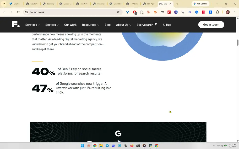
A stacked stat block with oversized bold numbers ('40%', '47%') paired with one-line explanatory captions, set off by a thin accent rule. She likely likes how a couple of punchy, sourced statistics about AI search behavior instantly establish authority and urgency without a paragraph of text. Transferable best practice: lead a section with 2-3 big proof-stats relevant to AI search (e.g. share of searches triggering AI Overviews) to make the case data-first.

What you like about this page

Clean, light, generous-whitespace layout that alternates large numerals with restrained body copy, keeping a data-heavy message calm and credible rather than cluttered.

Found / Lumin (found.co.uk/lumin) screenshot 387
#387 Found / Lumin (found.co.uk/lumin)
What you like about this section

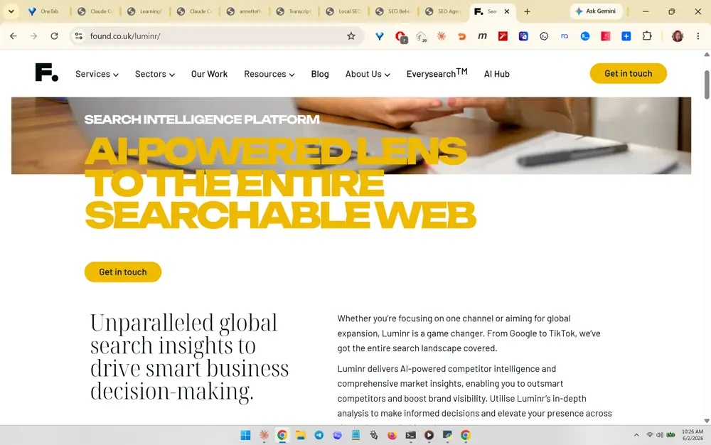
A hero with a full-bleed background photo overlaid by a giant yellow all-caps headline ('AI-POWERED LENS TO THE ENTIRE SEARCHABLE WEB') and a single 'Get in touch' CTA button. She likely likes the bold color-on-photo headline treatment plus the immediate two-column value statement below (serif promise on the left, plain-language explanation on the right). Transferable best practice: pair a high-contrast colored hero headline over imagery with one clear CTA, then immediately reinforce with a serif benefit statement.

What you like about this page

Confident editorial feel: a striking colored hero followed by a serif headline and explanatory body in a balanced two-column block, signaling premium positioning.

Found (found.co.uk/lumin) screenshot 388
#388 Found (found.co.uk/lumin)
What you like about this section

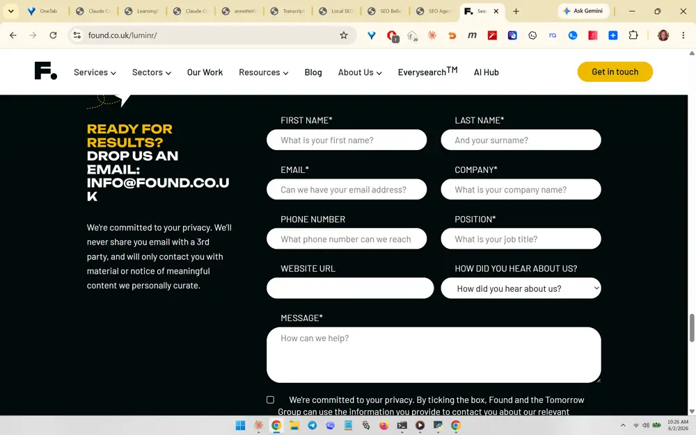
A dark contact section with a friendly all-caps headline ('READY FOR RESULTS? DROP US AN EMAIL') beside a clean multi-field form with rounded pill inputs and an explicit privacy reassurance ('We'll never share your email'). She likely likes the warm, human form intro plus the trust microcopy reducing friction. Transferable best practice: give the contact form a personable headline, rounded approachable fields, and a one-line privacy promise to lift conversions.

What you like about this page

A well-structured two-column contact layout that pairs reassuring copy on the left with a complete, low-friction form on the right, on-brand dark panel for contrast.

Found (found.co.uk/lumin) screenshot 389
#389 Found (found.co.uk/lumin)
What you like about this section

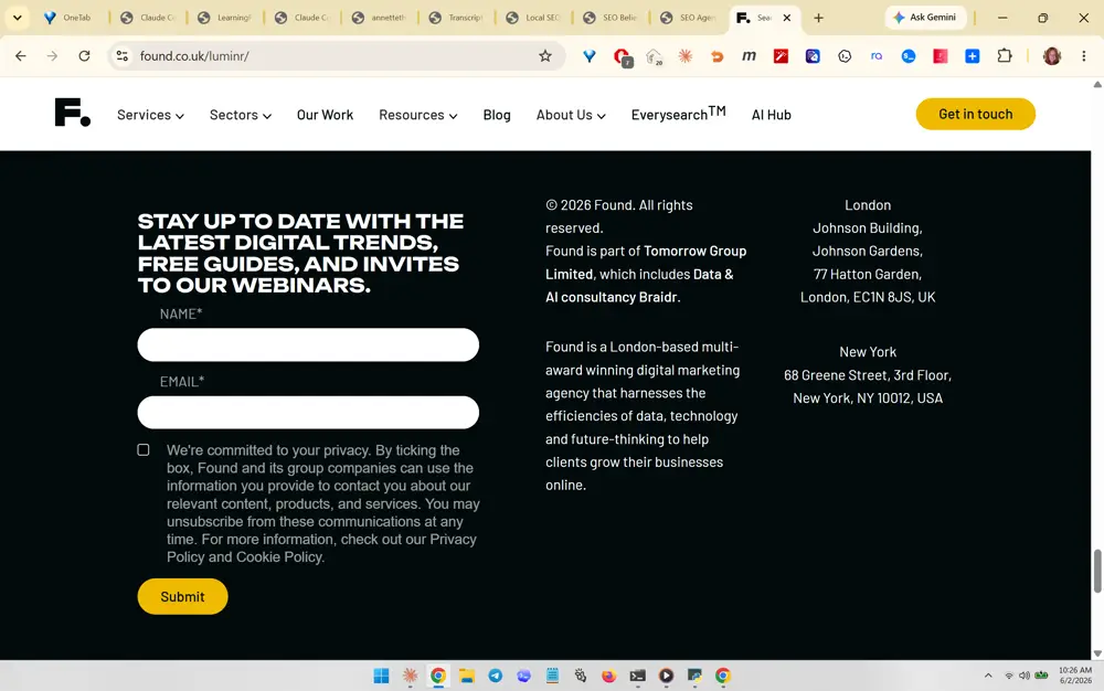
A newsletter/webinar opt-in block embedded in the footer ('STAY UP TO DATE WITH THE LATEST DIGITAL TRENDS, FREE GUIDES, AND INVITES TO OUR WEBINARS') with a minimal Name/Email form, consent checkbox, and yellow Submit button, sitting beside tidy footer address columns. She likely likes capturing leads with a value-led email signup right in the footer. Transferable best practice: add a benefit-driven email capture (guides + webinar invites) in the footer alongside NAP-style contact columns.

What you like about this page

A purposeful footer that doubles as a lead-capture zone, with a value-stated opt-in on the left and clean multi-location address blocks on the right.

King Kong (kingkong.co) screenshot 390
#390 King Kong (kingkong.co)
What you like about this section

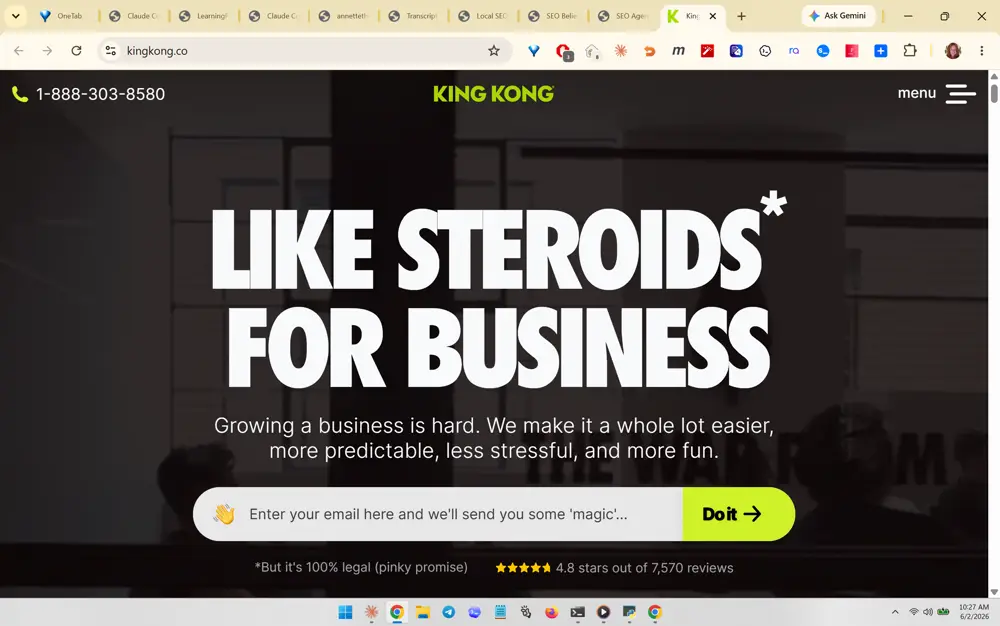
The hero: a massive all-caps headline ('LIKE STEROIDS* FOR BUSINESS') over a dark photo, a one-line benefit subhead, an inline email-capture bar with a punchy 'Do it' button, and a trust row beneath ('4.8 stars out of 7,570 reviews' + a playful disclaimer). She likely likes the bold provocative hook plus immediate email capture and star-rating social proof in the first screen. Transferable best practice: combine a bold hook headline, a single inline email-capture field, and a star-rating proof line above the fold.

What you like about this page

High-energy conversion-first hero that fits hook, promise, capture, and social proof into one above-the-fold view without feeling crowded.

King Kong (kingkong.co) screenshot 391
#391 King Kong (kingkong.co)
What you like about this section

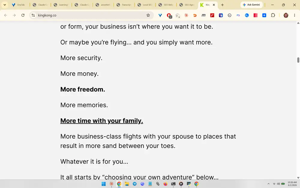
A long-form sales narrative using short one-line paragraphs and bolded/underlined emotional phrases ('More freedom.', 'More time with your family.') that build aspiration before the CTA. She likely likes the rhythmic, skimmable copywriting that sells the outcome and lifestyle rather than the service. Transferable best practice: use short, escalating one-line sentences with selective bold/underline to make long copy emotionally compelling and easy to scan.

What you like about this page

Readable, conversational long-form section with airy line spacing that keeps a persuasive narrative from feeling like a wall of text.

King Kong (kingkong.co/quantum-growth) screenshot 392
#392 King Kong (kingkong.co/quantum-growth)
What you like about this section

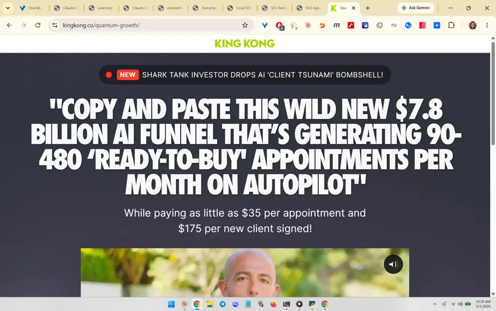
A VSL-style landing hero: a red 'NEW' news-ticker eyebrow, a huge quotation-mark headline with a specific dollar/number claim ('$7.8 BILLION AI FUNNEL... 90-480 READY-TO-BUY APPOINTMENTS PER MONTH'), a specific-price subhead, and a video below. She likely likes the curiosity-driven, hyper-specific numeric headline plus the news-flash eyebrow that signals timeliness. Transferable best practice: front a campaign page with a specific-number outcome headline and a 'NEW/breaking' eyebrow to drive curiosity and credibility.

What you like about this page

Aggressive direct-response page architecture that stacks eyebrow, specific-claim headline, price proof, and an explainer video in a clear top-down read.

King Kong (kingkong.co) screenshot 393
#393 King Kong (kingkong.co)
What you like about this section

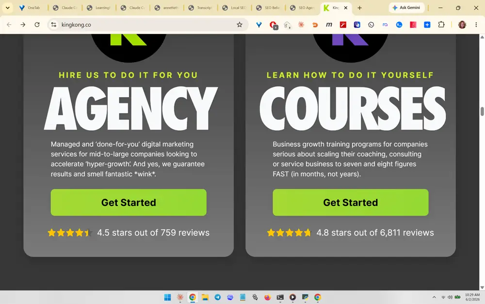
A two-path choice block: side-by-side cards ('HIRE US TO DO IT FOR YOU / AGENCY' vs 'LEARN HOW TO DO IT YOURSELF / COURSES'), each with a short description, green 'Get Started' button, and its own star-rating + review count. She likely likes segmenting visitors into done-for-you vs DIY with proof on each path. Transferable best practice: offer two clear audience paths as parallel cards, each with its own CTA and independent social-proof rating.

What you like about this page

Clean dual-card decision layout that lets distinct buyer types self-select while reinforcing each option with reviews.

King Kong (kingkong.co) screenshot 394
#394 King Kong (kingkong.co)
What you like about this section

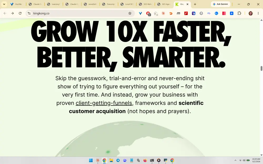
A bold section headline ('GROW 10X FASTER, BETTER, SMARTER.') in a heavy display font with a tight subhead that uses underlined keyword phrases ('client-getting-funnels', 'scientific customer acquisition') to anchor the methodology. She likely likes the oversized punchy headline paired with credibility-keyword underlines over a subtle globe background. Transferable best practice: use a heavy display headline plus a benefit subhead with underlined signature-method terms to brand the approach.

What you like about this page

Strong typographic hierarchy and a light cheerful background that keeps a bold claim feeling approachable and premium.

King Kong (kingkong.co) screenshot 395
#395 King Kong (kingkong.co)
What you like about this section

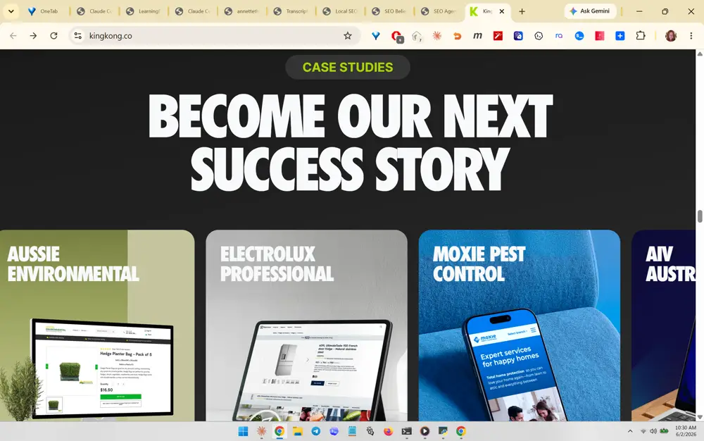
A case-studies gallery: a pill 'CASE STUDIES' eyebrow, a big headline ('BECOME OUR NEXT SUCCESS STORY'), and a horizontal row of named client cards each showing a device mockup of the client's site (Aussie Environmental, Electrolux, Moxie Pest Control, etc.). She likely likes the visual, named, device-mockup proof carousel that makes results tangible. Transferable best practice: present case studies as a horizontally scrollable row of named client cards with screenshot/device mockups and an inviting 'become our next success story' framing.

What you like about this page

Visually rich, proof-heavy section that turns results into a browsable, branded gallery rather than a text list.

King Kong (kingkong.co) screenshot 396
#396 King Kong (kingkong.co)
What you like about this section

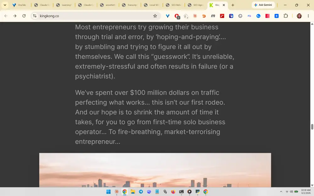
The empathy-plus-proof body copy block. It names the prospect's actual pain ('hoping-and-praying', 'guesswork', stressful, ends in failure) then drops a hard credibility number ('We've spent over $100 million on traffic perfecting what works... this isn't our first rodeo'). The transferable practice: pair a vivid description of the reader's current struggle with a concrete, hard-to-fake spend/scale stat that earns the right to be believed. Generous line-height and short paragraphs keep long copy readable.

What you like about this page

A confident, conversion-led long-form sales page that leads with the reader's emotion before any feature talk, set on a light page with a soft sunset cityscape image breaking up the text.

King Kong (kingkong.co) screenshot 397
#397 King Kong (kingkong.co)
What you like about this section

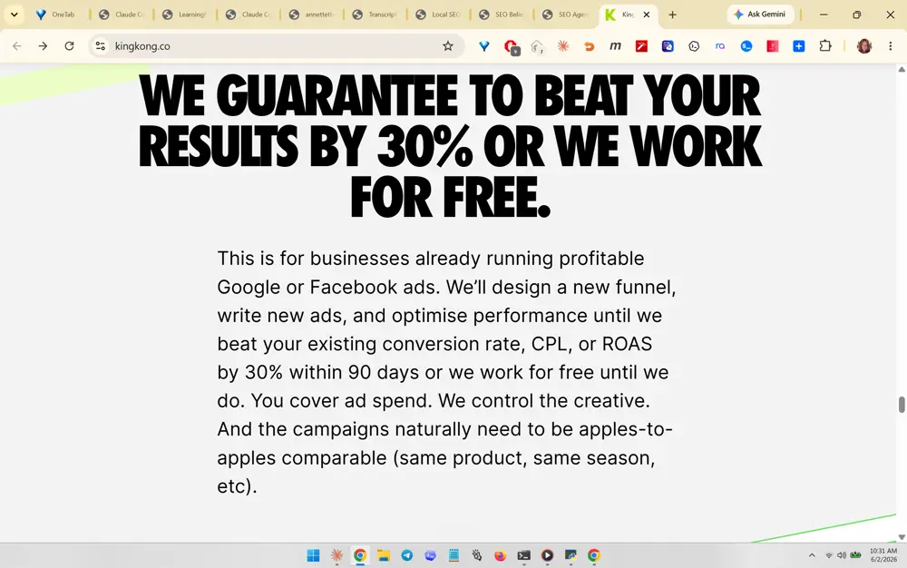
The oversized risk-reversal guarantee headline: 'WE GUARANTEE TO BEAT YOUR RESULTS BY 30% OR WE WORK FOR FREE.' set in heavy black all-caps, with fine-print qualifiers below that make the guarantee credible (who it's for, the 90-day window, who controls creative, apples-to-apples comparison). Transferable practice: make a bold, specific, measurable guarantee the visual centerpiece, then immediately fence it with honest conditions so it reads as real rather than hype. This is a strong trust device SEO Believer could adapt for a ranking/citation guarantee.

What you like about this page

Clean white page where a single giant promise dominates the viewport, with restrained supporting paragraph copy and a thin lime accent line at the edge.

King Kong (kingkong.co) screenshot 398
#398 King Kong (kingkong.co)
What you like about this section

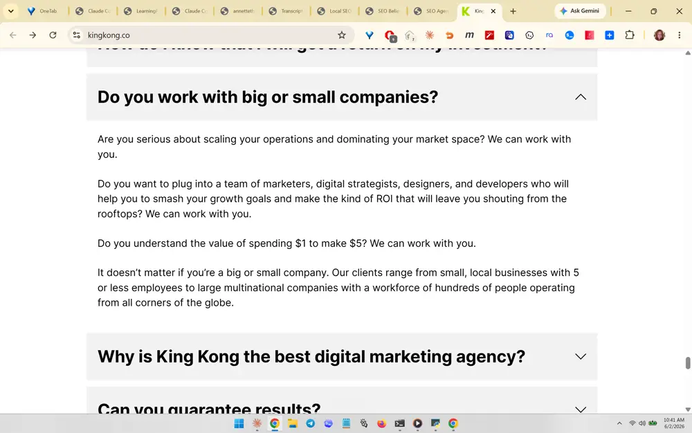
An expandable FAQ accordion ('Do you work with big or small companies?', 'Why is King Kong the best digital marketing agency?', 'Can you guarantee results?'). The likable detail is the answer copy itself, which reframes objections as qualification ('Are you serious about scaling... We can work with you' repeated as a rhythmic refrain). Transferable practice: use an accordion FAQ near the bottom of the page to neutralize the exact objections that stall a sale, written in a confident, repeatable cadence rather than dry Q&A.

What you like about this page

A tidy, scannable FAQ section with light-gray collapsed rows and clear chevrons, making a long list of objections feel light and navigable.

King Kong (kingkong.co) screenshot 399
#399 King Kong (kingkong.co)
What you like about this section

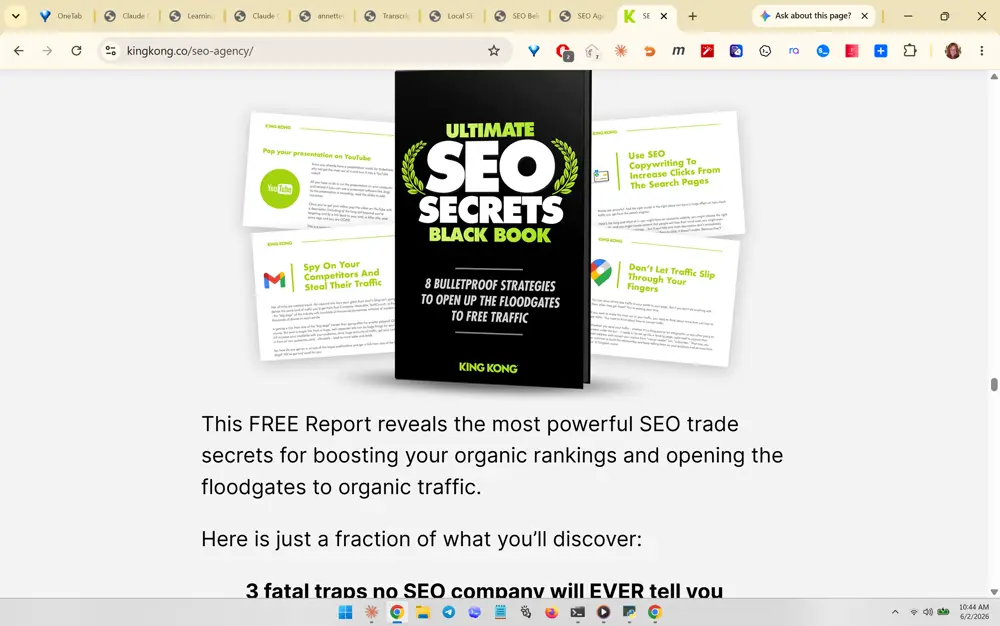
The gated lead-magnet hero: a 3D book mockup of the 'Ultimate SEO Secrets Black Book' surrounded by floating page previews, with 'This FREE Report reveals...' and a bulleted 'Here is just a fraction of what you'll discover' teaser list. Transferable practice: package a free PDF/report as a tangible 3D book cover (not a flat thumbnail) and sell it with curiosity-gap bullets to capture email. SEO Believer could do this with its GEO/AI-search guide.

What you like about this page

Visually rich lead-capture page that makes a downloadable report feel like a real product, using a bold black-and-green cover against a white background.

Comrade Digital Marketing (comradeweb.com) screenshot 400
#400 Comrade Digital Marketing (comradeweb.com)
What you like about this section

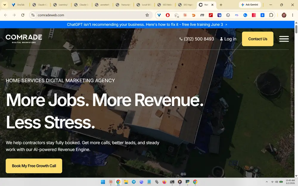
The homepage hero over a full-bleed background image (aerial roofing/contractor jobsite) with the benefit-stacked headline 'More Jobs. More Revenue. Less Stress.', a one-line value prop naming an 'AI-powered Revenue Engine', and a single yellow CTA 'Book My Free Growth Call'. Note the thin top announcement bar: 'ChatGPT isn't recommending your business. Here's how to fix it - free live training.' Transferable practice: niche-specific hero image + rhythmic three-part benefit headline + one high-contrast CTA, plus a timely AI-search hook in the announcement bar (directly relevant to SEO Believer's GEO positioning).

What you like about this page

Polished, modern agency homepage with a strong photo-backed hero, a sticky utility bar (phone, login, Contact Us), and a single clear conversion path.

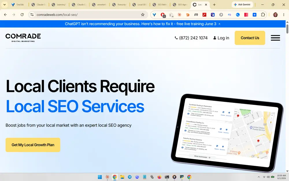
Comrade Digital Marketing (comradeweb.com/local-seo) screenshot 401
#401 Comrade Digital Marketing (comradeweb.com/local-seo)
What you like about this section

The Local SEO service hero pairing a two-tone headline ('Local Clients Require Local SEO Services', with 'Local SEO Services' in blue to emphasize the keyword) against a tilted tablet device mockup showing a live Google Maps 3-pack / local results screenshot. Transferable practice: color-highlight the target keyword inside the H1, and show a real product screenshot inside a device frame so the abstract service becomes visually concrete. The CTA reframes the offer as a 'Local Growth Plan' rather than generic 'contact'.

What you like about this page

Bright, airy service page on a soft white-to-blue gradient with a single device mockup that instantly communicates what local SEO delivers.

Comrade Digital Marketing (comradeweb.com/local-seo) screenshot 402
#402 Comrade Digital Marketing (comradeweb.com/local-seo)
What you like about this section

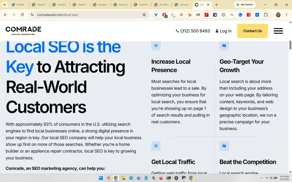
A benefits grid below the hero: a left-column statement headline ('Local SEO is the Key to Attracting Real-World Customers') backed by a credibility stat ('approximately 93% of consumers...'), beside a multi-cell grid of icon + heading + short paragraph blocks (Increase Local Presence, Geo-Target Your Growth, Get Local Traffic, Beat the Competition). Transferable practice: break service value into 4-6 scannable icon cards with concrete benefit names, anchored by a single supporting statistic. SEO Believer could mirror this for its local + GEO benefits.

What you like about this page

Clean editorial layout that balances a bold left-side claim with an easy-to-skim feature grid, heavy on white space.

Comrade Digital Marketing (comradeweb.com/local-seo-packages) screenshot 403
#403 Comrade Digital Marketing (comradeweb.com/local-seo-packages)
What you like about this section

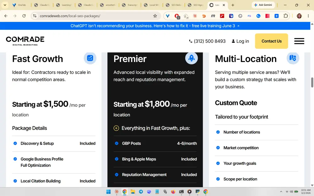
A three-tier pricing table (Fast Growth $1,500/mo, Premier $1,800/mo, Multi-Location Custom Quote) with the middle 'Premier' tier visually emphasized via an inverted dark card, an 'Everything in Fast Growth, plus:' framing, and checkmarked inclusions (GBP Posts 4-6/month, Bing & Apple Maps, Reputation Management). Transferable practice: show transparent 'Starting at' productized pricing in tiers, highlight the recommended middle tier with contrasting color, and use 'everything in X plus' stacking. This directly supports the CLAUDE.md goal of anchored pricing bands that filter tire-kickers.

What you like about this page

A confident pricing page that doesn't hide cost; the dark center card draws the eye to the intended default choice.

Comrade Digital Marketing (comradeweb.com/local-seo-packages) screenshot 404
#404 Comrade Digital Marketing (comradeweb.com/local-seo-packages)
What you like about this section

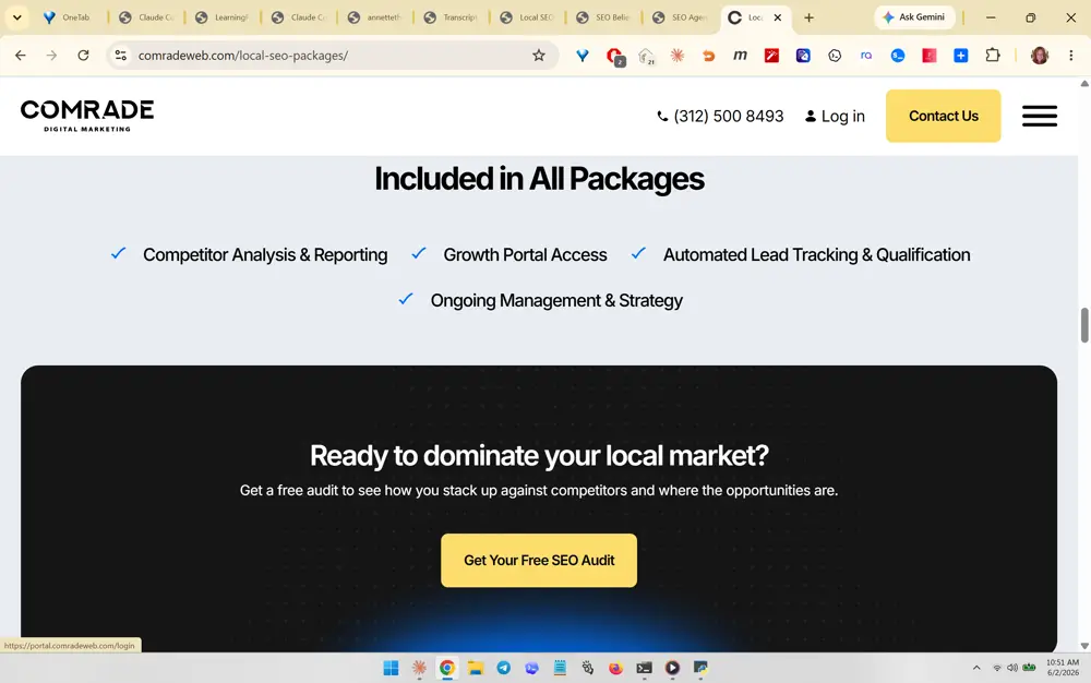
The 'Included in All Packages' reassurance row (Competitor Analysis & Reporting, Growth Portal Access, Automated Lead Tracking & Qualification, Ongoing Management & Strategy) sitting above a high-contrast dark CTA band: 'Ready to dominate your local market?' with a yellow 'Get Your Free SEO Audit' button. Transferable practice: after the pricing tiers, list the universal inclusions so no tier feels stripped-down, then close with a single bold dark-banded free-audit CTA. The free audit as the closing offer is a low-friction lead magnet SEO Believer already plans.

What you like about this page

Reduces price anxiety with shared inclusions, then funnels every reader to one strong free-audit CTA in a focused dark section.

Comrade Digital Marketing (comradeweb.com/contact-us) screenshot 405
#405 Comrade Digital Marketing (comradeweb.com/contact-us)
What you like about this section

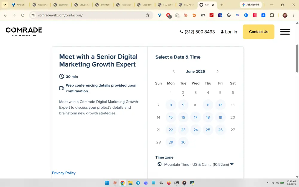
An embedded inline booking/scheduling widget on the contact page: left side sets expectations ('Meet with a Senior Digital Marketing Growth Expert', 30 min, web-conferencing details, short description), right side is a live calendar with selectable dates and an auto-detected time zone. Transferable practice: embed the scheduler directly in the page (no redirect), label the call as time-boxed and with a senior expert to raise perceived value, and show real availability to reduce booking friction. Matches SEO Believer's Phase 7 Cal.com/SavvyCal plan.

What you like about this page

Frictionless contact page that turns 'contact us' into an immediate booking action, with clear expectations beside a live calendar.

Wolfgang Digital screenshot 406
#406 Wolfgang Digital
What you like about this section

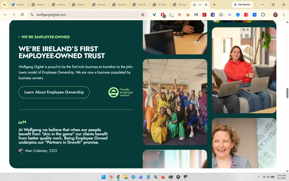
A dark forest-green panel pairing a trust/credibility headline ("We're Ireland's first employee-owned trust") with a CEO pull-quote and a collage of candid team photos. What she likely likes: humanizing the agency with real faces and a values story instead of stock imagery, plus a named-CEO testimonial that builds authenticity. Transferable: lead trust sections with a genuine founder/owner story and real photos, not generic claims.

What you like about this page

The page balances a confident credibility statement against warm human photography, making a B2B agency feel trustworthy and personal.

Youtech screenshot 407
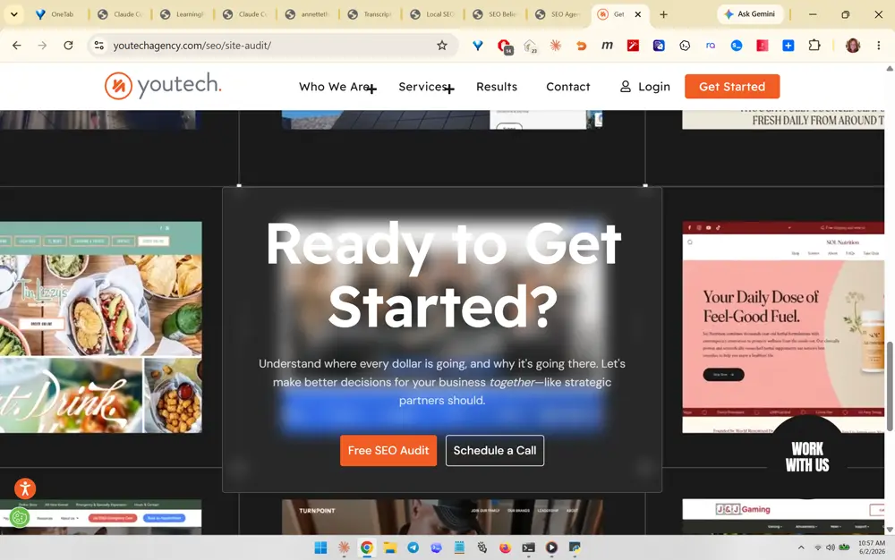
#407 Youtech
What you like about this section

A centered mid-page CTA overlay ("Ready to Get Started?") floating over a blurred portfolio-work background, with two clear buttons: a primary orange "Free SEO Audit" and secondary "Schedule a Call." What she likes: the dual-CTA pattern offering a low-friction lead magnet alongside a direct booking, plus the blurred-work backdrop that doubles as social proof. Transferable: place a high-contrast mid-scroll CTA with a free-audit primary action and a call secondary action.

What you like about this page

The page uses real client website thumbnails as a textured backdrop and interrupts the scroll with a focused conversion moment.

A3 Brands screenshot 408
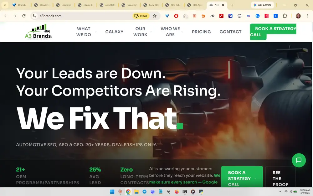
#408 A3 Brands
What you like about this section

The hero: a punchy problem-agitation headline stack ("Your Leads are Down. Your Competitors Are Rising. We Fix That.") over a dramatic dark automotive-engine image, with a niche-positioning subline and a green "Book a Strategy Call" CTA. What she likes: the bold oversized type, the problem-then-solution copy rhythm, and tight vertical-niche focus ("Dealerships only"). Transferable: open with a fear-then-fix headline and a single clear booking CTA.

What you like about this page

The page commits hard to a niche and a pain-first message, with strong typographic hierarchy and a high-contrast accent CTA color.

A3 Brands screenshot 409
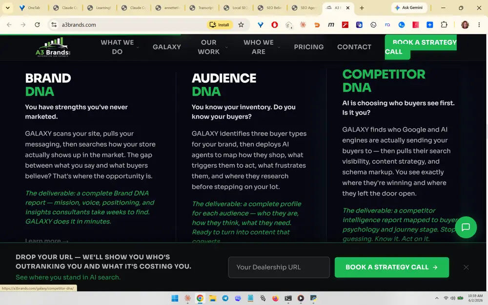
#409 A3 Brands
What you like about this section

A three-column "DNA" features grid (Brand DNA / Audience DNA / Competitor DNA) where each column poses a provocative question, explains the insight, and names a concrete deliverable in colored italic text. What she likes: the consistent branded naming convention and the explicit deliverable per service, which makes abstract SEO work feel tangible. Transferable: structure services as named, parallel cards each ending with a specific deliverable.

What you like about this page

The page reframes generic services with proprietary branded names and an AI-search angle, plus a sticky URL-capture bar at the bottom.

A3 Brands screenshot 410
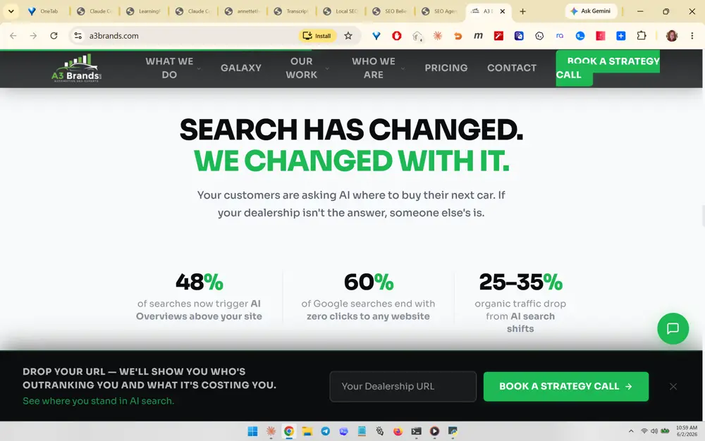
#410 A3 Brands
What you like about this section

A stat-driven section under "Search Has Changed. We Changed With It." with three large green percentage figures (48% / 60% / 25-35%) each backed by a one-line AI-search statistic. What she likes: using bold data points to make the AI-search shift urgent and credible, with the accent color drawing the eye to the numbers. Transferable: anchor the AI-search argument with three punchy, sourced statistics.

What you like about this page

The page builds urgency through clean stat presentation and keeps the sticky lead-capture bar persistent across sections.

A3 Brands screenshot 411
#411 A3 Brands
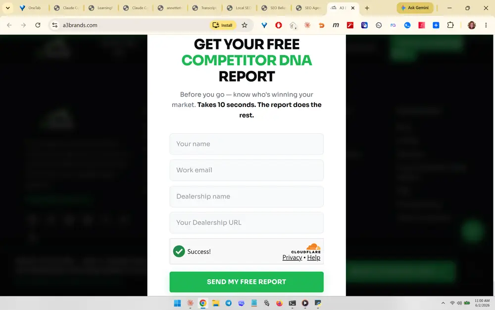
What you like about this section

An exit-intent / lead-capture modal ("Get Your Free Competitor DNA Report") with a short multi-field form, a friction-reducing reassurance line ("Takes 10 seconds. The report does the rest."), a Cloudflare Turnstile success check, and a green submit button. What she likes: the value-named lead magnet, the time-cost reassurance, and visible spam protection. Transferable: offer a branded free report behind a short form with a clear effort-cost promise.

What you like about this page

The modal dims the page and focuses entirely on a single conversion action with minimal fields and a strong value proposition.

Rock Salt Marketing screenshot 412
#412 Rock Salt Marketing
What you like about this section

A hero with a third-party review-rating cluster (Google / Clutch / DesignRush, each 5 stars and "10+ Reviews") placed above the headline, over a dramatic rock-climber silhouette image tied to the "Let's Climb" brand metaphor. What she likes: front-loading independent star-rating social proof in the hero and a memorable visual metaphor with a themed CTA. Transferable: put multi-platform review badges in the hero and tie imagery/CTA to a single brand metaphor.

What you like about this page

The page leads with credibility badges and a cinematic on-brand background, keeping the headline and CTA clean and confident.

Wonderist Agency screenshot 413
#413 Wonderist Agency
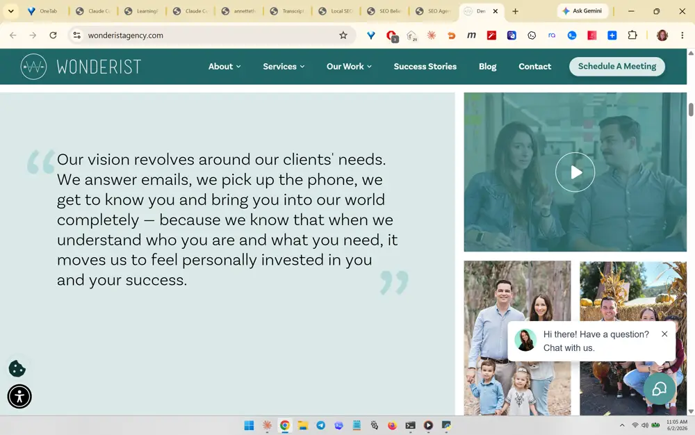
What you like about this section

A two-column section pairing a large founder-voice pull-quote about client care ("we answer emails, we pick up the phone...") on a soft mint background with a play-button video thumbnail and warm human/family photos. What she likes: the personal, relationship-first brand promise rendered as a big readable quote next to a real video. Transferable: express your service philosophy as a human-voice quote beside authentic video/photo proof.

What you like about this page

The page feels warm and personable, using soft brand colors, large readable typography, and real human imagery over stock.

Wonderist Agency screenshot 414
#414 Wonderist Agency
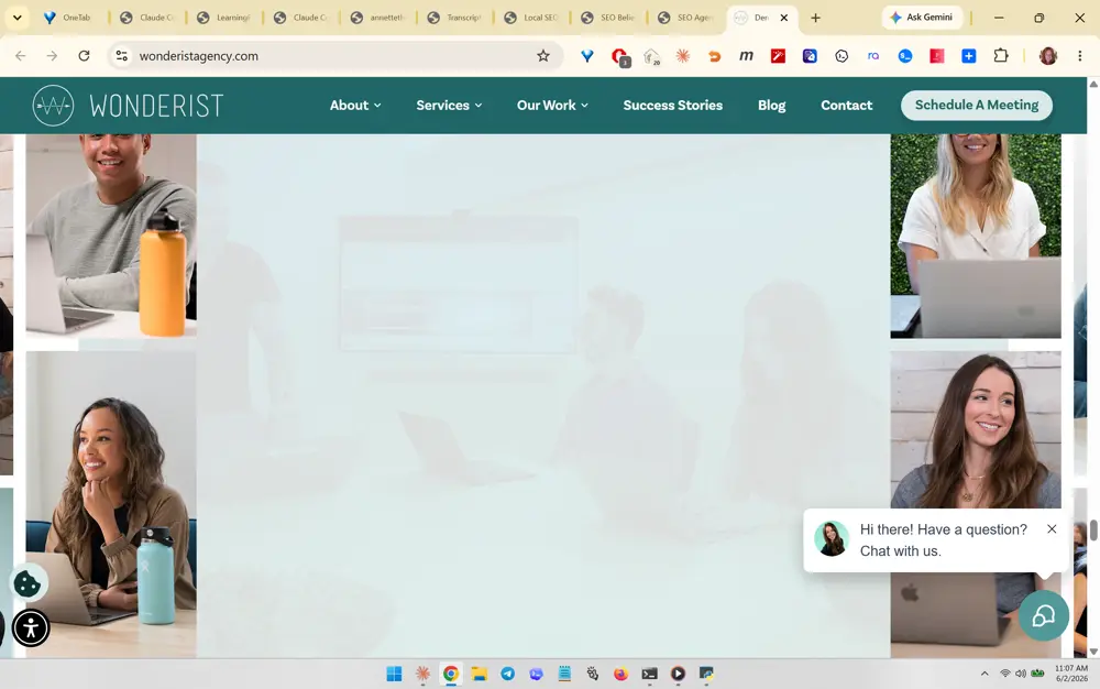
What you like about this section

A full-width photo-mosaic band of candid team/client portraits (people on laptops, smiling) framing a faded central meeting image. What she likes: the grid-of-real-faces layout that conveys an approachable, human team at scale without stock photography. Transferable: use an edge-to-edge mosaic of authentic candid photos to humanize an about/team or culture section.

What you like about this page

The page leans on genuine human warmth and a cohesive mint-and-teal palette, reinforcing an approachable agency personality.

SEOteric screenshot 415
#415 SEOteric
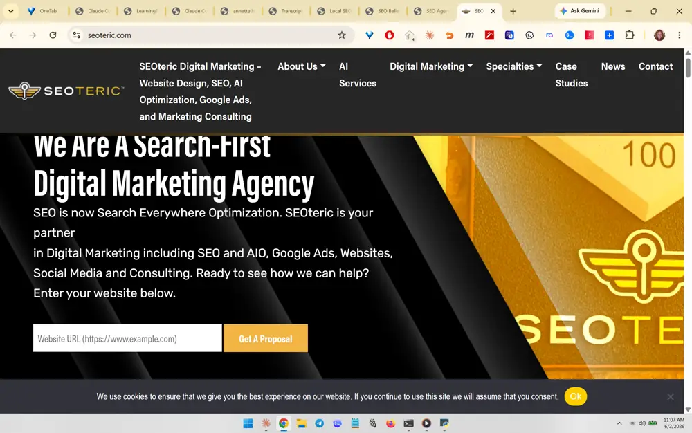
What you like about this section

A hero with an inline URL-entry field ("Website URL") plus a "Get A Proposal" button embedded directly in the headline area, over a dark gold-bar ("100") brand image, alongside a "Search-First" / "Search Everywhere Optimization" positioning line. What she likes: the instant-action URL capture right in the hero and the AI-era repositioning of SEO. Transferable: put a one-field URL-to-audit/proposal capture directly in the hero so visitors can act immediately.

What you like about this page

The page converts curiosity into a lead at first glance with an in-hero URL field and a modern "search everywhere" positioning statement.

Internal build reference · Private · 50 screenshots · ← Hub