RecipeMemoir Style Gallery Audit
Enter hub password to continue.
That's not it. Try again.
31 Styles, 6 Taste Families: what each style really is, and how to fix the gallery
- 4 duplicate clusters found (7 pages that are color-swaps of another page)
- 0 of 31 styles include a creator photo or bio block
- 30 of 31 styles use fully sharp photo corners (Joy the Baker's 4px is the only exception)
- Coverage skews classic + cheerful; modern, elegant, and edgy cooks are underserved
How to read the cards
Each card shows the top of the live style page, what opens the page (the hero), what editorial content it has, the photo shapes and approximate dimensions, and a distinctiveness score out of 5 (how instantly recognizable it is next to the other 30). Amber notes flag near-duplicates. None of the styles include a creator bio, so it isn't repeated on every card.
Classic Magazine (10 styles)
Serif type, big photography, editorial confidence. For the cook who wants her site to feel like a food magazine.
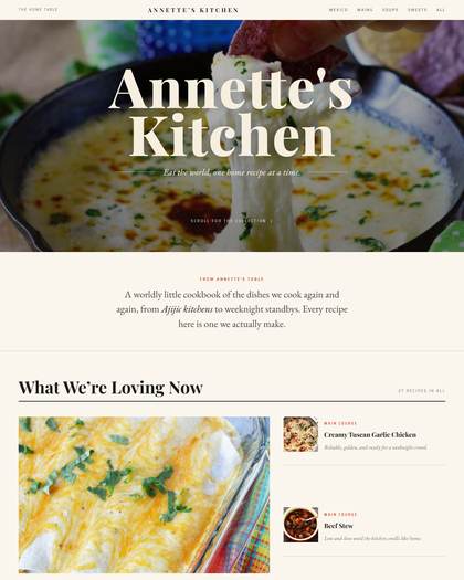
Opens with: Full-bleed photo hero, giant serif title overlaid
Editorial: Real intro prose ("A worldly little cookbook...") + feature-and-list layout
Photos: Landscape + small squares, sharp corners, feature ~700x580
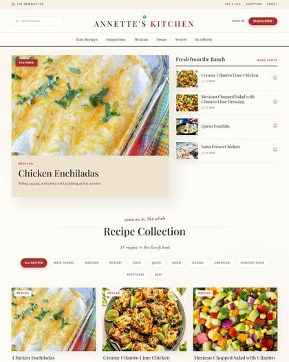
Opens with: Magazine masthead + big feature photo with "Fresh from the Ranch" sidebar list
Editorial: Script kicker + collection headline
Photos: Large landscape feature ~700x445, small square sidebar thumbs, sharp
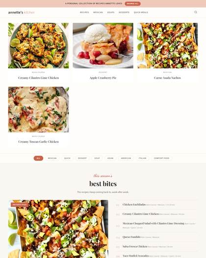
Opens with: No hero photo; straight into cards under the nav
Editorial: Standout: numbered "best bites" ranked list (01-10) beside an Editor’s Pick photo
Photos: Landscape ~377x282 cards, sharp
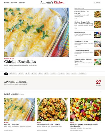
Opens with: Newspaper front page: big lead photo + "Latest Additions" sidebar column
Editorial: Recipe of the Day treatment, chip filters
Photos: Large landscape lead ~793x594, tiny square sidebar thumbs, sharp
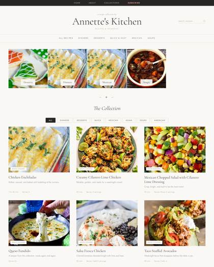
Opens with: Text-only serif wordmark, no photo hero
Editorial: Category photo-tile strip + decorative dividers
Photos: Square ~234x234 tiles + landscape cards, sharp
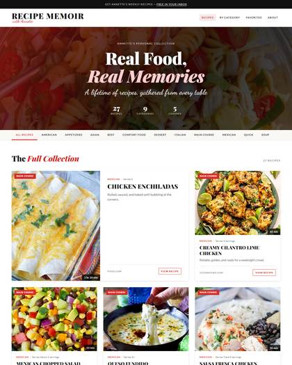
Opens with: Full-bleed dark-overlay hero with italic serif headline + stat row (27 recipes / 9 categories)
Editorial: Directory-style list cards with source attribution + VIEW RECIPE buttons
Photos: Portrait-leaning ~388x482 first card, sharp
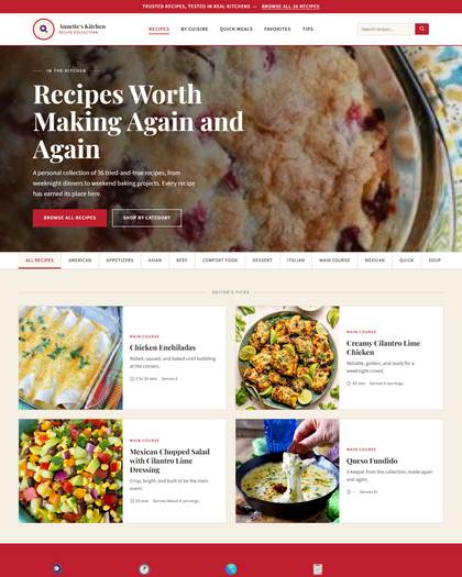
Opens with: Full-bleed photo hero, white headline, two CTA buttons
Editorial: Editor’s Picks 2x2 + trust badges (Tested, Time-Noted)
Photos: Square ~287x287 cards, sharp
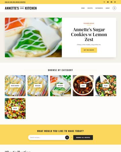
Opens with: Split hero: photo left, white panel right with yellow Get the Recipe button
Editorial: Category photo tiles + yellow search band
Photos: Landscape ~602x417 feature, small square tiles, sharp
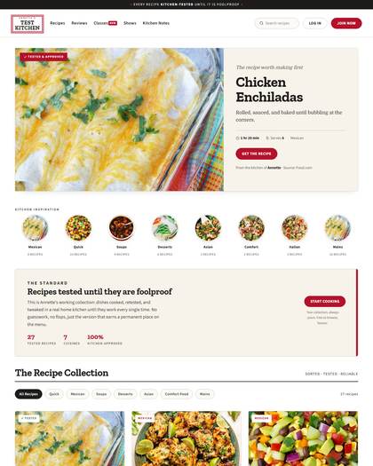
Opens with: Utility header + split feature panel with TESTED & APPROVED badge
Editorial: Trust-stat band ("27 tested recipes, 100% kitchen-approved") + circular category row
Photos: Landscape ~715x491 feature, circle category icons, sharp
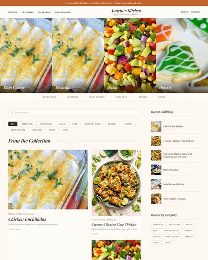
Opens with: 4-photo mosaic strip with category labels
Editorial: None; straight to grid
Photos: Portrait ~320x461 cards, near-sharp
Modern & Clean (4 styles)
Whitespace, sans-serif or restrained serif, crisp structure. For the cook who wants it to feel like an app.
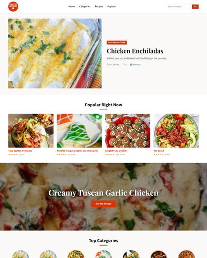
Opens with: Split hero: photo + featured panel
Editorial: Popular Right Now row with STAR RATINGS (only style with them) + circular category icons
Photos: Landscape ~577x433 + circles; most shape variety of any style
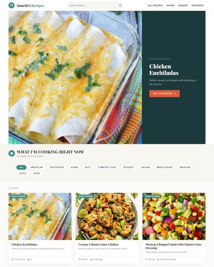
Opens with: Split hero: big photo + dark teal text panel with orange CTA
Editorial: Chip filter bar, tidy uniform grid
Photos: Square ~798x798 hero crop, sharp
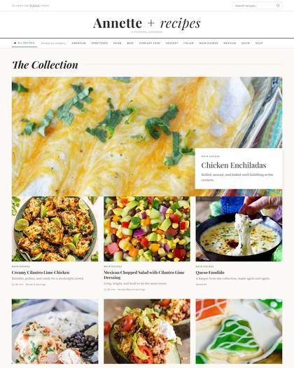
Opens with: Airy text wordmark ("Annette + recipes"), no hero photo
Editorial: One huge featured photo with overlaid white text card
Photos: Full-width feature ~1178x520, landscape cards, sharp
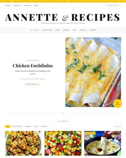
Opens with: Giant serif masthead "ANNETTE & RECIPES" with yellow ticker bar
Editorial: Featured-recipe split with yellow badges and category labels
Photos: Portrait ~565x706 feature, sharp, yellow corner medallion
Cheerful & Bright (7 styles)
Color-forward, playful type, friendly energy. For the cook whose kitchen is the happiest room in the house.
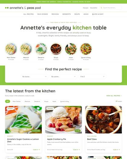
Opens with: Text header with two-dot logo + two-tone green headline, no photo
Editorial: Dotted-border circular category icons + "find the perfect recipe" dropdown filters
Photos: Landscape cards + circle icons, sharp
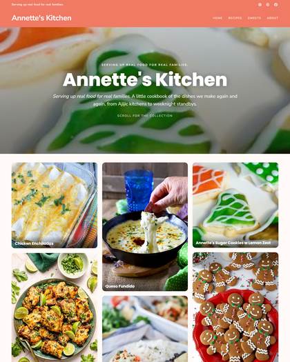
Opens with: Full-bleed photo hero, bold sans headline
Editorial: Masonry grid with titles overlaid on photos (unique in the set)
Photos: MIXED portrait + landscape masonry, text-on-image, sharp
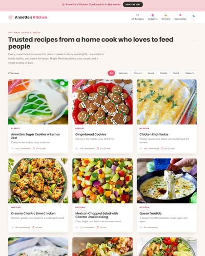
Opens with: Pink promo announcement bar + headline-first opener, no hero photo
Editorial: Intro prose + filter pills straight into grid
Photos: Landscape ~375x281 cards, slight rounding
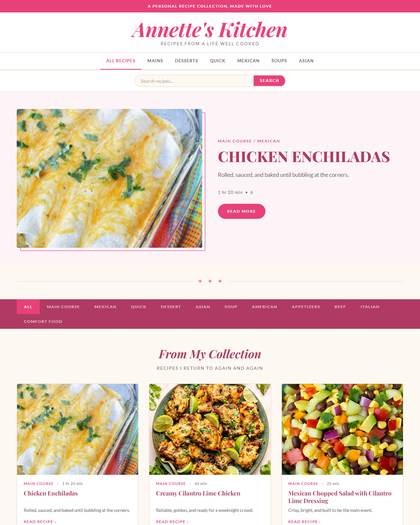
Opens with: Pink banner + script logo
Editorial: Featured-recipe split in a soft pink framed panel
Photos: Landscape ~565x424, the ONLY rounded corners in the gallery (4px)
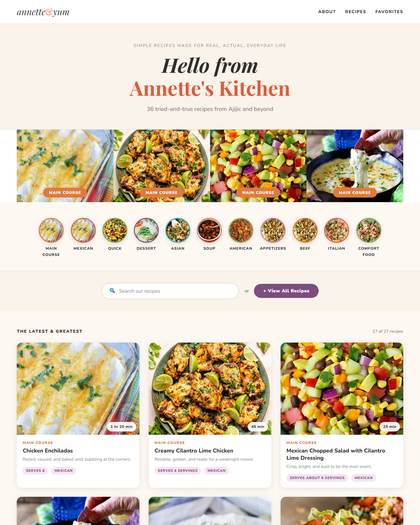
Opens with: Text hero ("Hello from Annette’s Kitchen") on peach
Editorial: Photo mosaic + circle category icons + big search
Photos: Landscape ~294x221 mosaic + circles, rounded badges
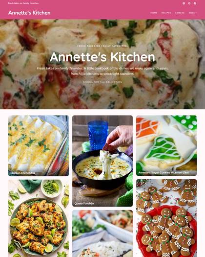
Opens with: Full-bleed dark-overlay hero, centered serif title, "scroll for the collection" cue
Editorial: None; straight to grid with caption scrims
Photos: Hero 1280x560, mixed grid, sharp
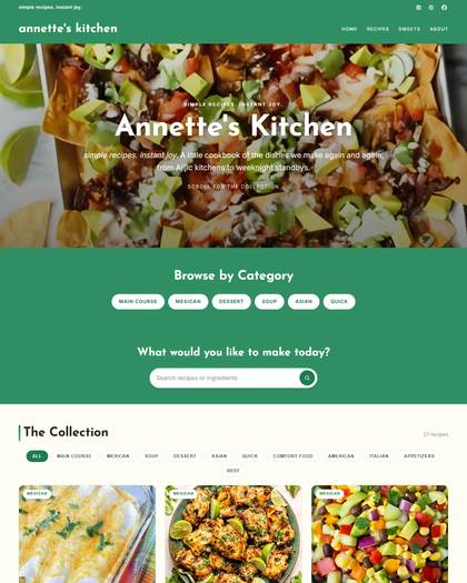
Opens with: Full-bleed dark-overlay hero, same skeleton as A Reinvented Mom
Editorial: Green category pill band + search band
Photos: Hero 1280x560, landscape cards, sharp
Country & Cozy (6 styles)
Warm earth tones, traditional layouts, comfort-food soul. For the cook who wants it to feel like home.
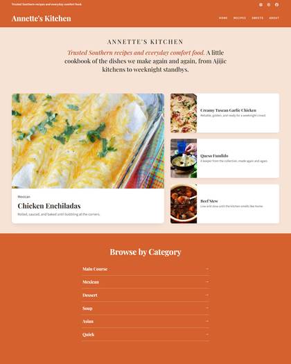
Opens with: Text-only title block on peach, then photo + stacked sidebar list
Editorial: Real intro paragraph + accordion Browse by Category band
Photos: Landscape ~670x419 feature + small square thumbs, sharp
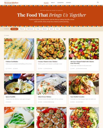
Opens with: Solid terracotta banner with italic display headline + dashed folk borders
Editorial: Filter pills straight into dense grid with category badges
Photos: Landscape ~374x262 cards, circle-grid label per gallery, sharp
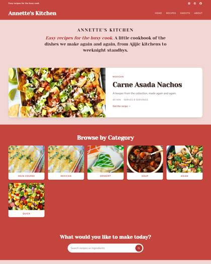
Opens with: Split hero: photo + white featured panel, red header
Editorial: Category icon grid + search prompt
Photos: Landscape ~588x300, sharp
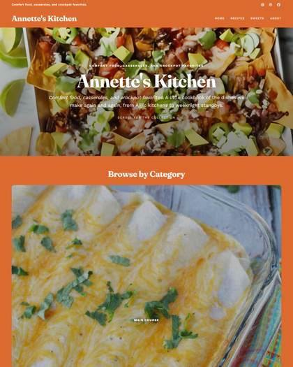
Opens with: Full-bleed dark-overlay hero, burnt orange banner
Editorial: Browse by Category with one oversized photo tile
Photos: Hero 1280x560, sharp
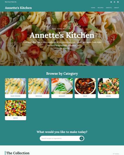
Opens with: Full-bleed photo hero with centered title + CTA, teal palette
Editorial: Category icon grid + search prompt
Photos: Hero 1280x560, landscape cards, sharp
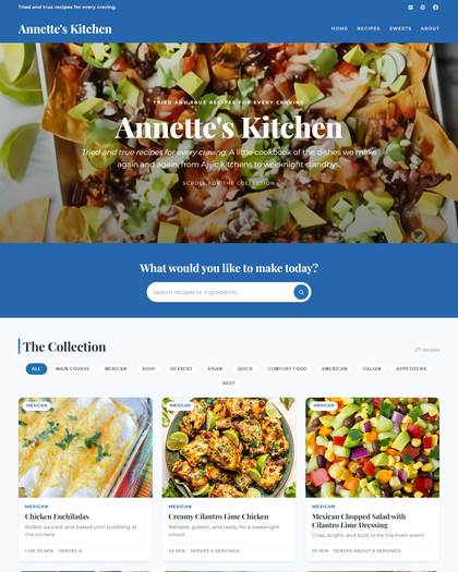
Opens with: Full-bleed photo hero, centered title, blue header
Editorial: No featured block; straight to search + grid
Photos: Hero 1280x560, landscape cards, sharp
Elegant & Romantic (2 styles)
Ivory, blush, refined serif details. For the cook who plates dessert on the good china.
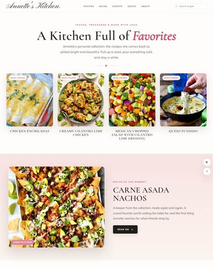
Opens with: Ivory text hero ("A Kitchen Full of Favorites") with heart divider
Editorial: Recipe of the Moment spotlight on a blush-pink full-bleed band
Photos: Squarish ~280x319 cards, captions BELOW photos (calmer feel), near-sharp
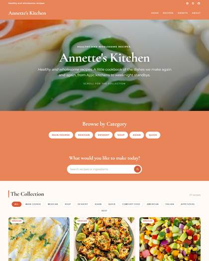
Opens with: Full-bleed photo hero with elegant italic subhead, terracotta accents
Editorial: Pill-only category row (no icons)
Photos: Hero 1280x560, landscape cards, sharp
Bold & Edgy (2 styles)
Strong color blocking, punchy condensed type. For the cook with opinions.
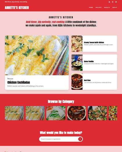
Opens with: Solid red banner + pink section block, no photo hero
Editorial: Feature + 3 stacked mini cards, red category band, red search band
Photos: Landscape ~670x419 feature + small thumbs, sharp
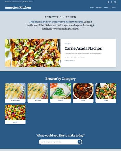
Opens with: Split hero: photo + white featured panel, navy header on blue-gray page
Editorial: Category icon grid + search prompt
Photos: Landscape ~588x300, sharp
The 4 duplicate clusters to fix
- A Reinvented Mom / Deliciously Seasoned / Dinner in 321: the same full-bleed-hero template in pink, autumn orange, and green. Keep A Reinvented Mom as the family's representative, then restructure the other two (give one a masonry grid, give one a split hero) or retire them.
- That Which Nourishes / The Recipe Critic: identical structure, teal vs blue. Keep one, restructure or retire the other.
- SmartyPants Kitchen / The Country Cook: identical split-hero template, navy vs red. Same call.
- Pinch of Yum / Half Baked Harvest: same "text hero, photo mosaic, category strip, grid" skeleton. Softer duplicate; differentiating the photo treatment (rounded on one, sharp on the other) may be enough.
What every single style is missing
- A "Meet the cook" block. Zero styles have a creator photo or bio. For a product whose promise is "Grandma's recipes become a gorgeous family cookbook," the cook's face and two warm sentences are the emotional heart. Recommend a standard optional bio section designed per family (circle photo for cheerful styles, editorial portrait for magazine styles, polaroid-style for country).
- Photo corner variety. 30 of 31 styles use fully sharp corners. Corner radius is a free differentiation lever: rounded cards for the cheerful family, circle crops for category icons, scalloped or framed treatments for country.
- Background commitment. 26 styles sit on nearly the same warm cream. Only 5 commit to a real page color. Letting each family own a background range would separate them at a glance.
The reorganization plan for /styles
- Group the gallery by the 6 taste families above, in this order: Classic Magazine, Modern & Clean, Cheerful & Bright, Country & Cozy, Elegant & Romantic, Bold & Edgy. Each section gets its name plus its one-line "for the cook who..." description, so people self-select by identity, not by layout jargon.
- Add taste filter chips at the top ("Show me: Modern · Classic · Country · Cheerful · Elegant · Bold") that scroll to or filter the sections.
- Rewrite the card labels. "COLLECTION · Hero + portrait grid" means nothing to a cook. Use taste language: "Warm magazine classic with big photography."
- Lead each family with its strongest style (highest distinctiveness): Saveur or Pioneer Woman for Classic, Natasha's for Modern, Two Peas or Mom On Timeout for Cheerful, Lana's or Mexico in My Kitchen for Country, Preppy Kitchen for Elegant, Andrew Zimmern for Bold.
- Fix the duplicate clusters so the count is honest: better 24 genuinely different styles than 31 that blur.
Gaps worth filling (new styles to design)
- Dark, moody editorial (think candlelit supper club): the entire gallery is light; some cooks want drama. This would be the one deliberate exception to the bright-sites rule, as a user-facing product choice.
- True minimalist: generous whitespace, one accent color, no bands or badges. The current "modern" styles are still fairly busy.
- Handwritten scrapbook country: recipe-card textures, handwritten-style headings, tape corners. The country family is the most requested taste for family cookbooks and currently has no craft-feel option.
- Elegant needs a second act: only 2 styles serve the romantic/fine-dining cook.