Gemini favicons, 16px test
Five sites at real tab size. Enter hub password to continue.
That's not right. Try again.
Brand / Design
Gemini favicons, the 16px test
Favicon concepts drawn by Gemini as real images instead of hand-built SVG, so you can see how an AI-generated mark actually behaves when it gets crushed down to browser tab size.
Every icon is shown at its true pixel size. The 16px column is genuinely 16 pixels wide on your screen right now, and each card ends with a mock Chrome tab in both light and dark theme, since that's the only context that matters.
What changed in this round
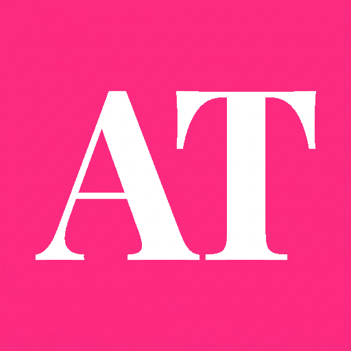
- Annette Thompson is the AT monogram now, not the single A.
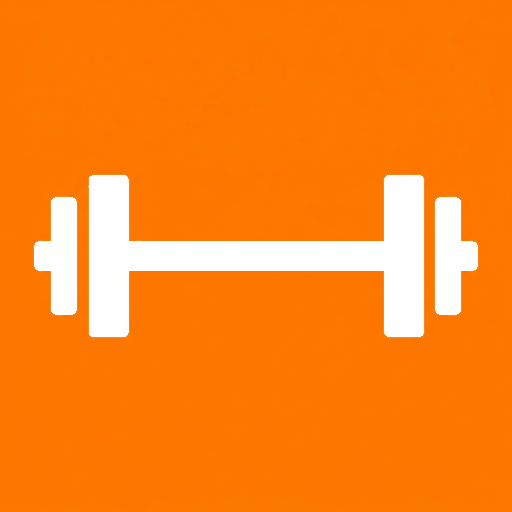
- TrainerBooked is the barbell, not the lightning bolt. Still no checkmark.
- SocialMapped lost the map pin entirely. The name says maps but the business is social media strategy and management, so all three new options say that instead. Pick one.
- Taste Boulder has a mountain now, in two arrangements: between the utensils, or behind them.
- RecipeMemoir is gone from this page. It already has a favicon.
Two things worth knowing before you judge these
- Zooming this page will not help. Browsers do not zoom the tab strip, so the tiny version is the honest one. Lean back instead of leaning in.
- Gemini cannot output a 16px image. These were generated at 1024px and downscaled with the same resampling a browser uses, which is why detail-heavy marks fall apart and simple silhouettes do not.
Annette Thompson
annettethompson.com
AT monogram on hot pink
 16px
16px  32px
32px  48px
48px  64px
64px  128px Annette Thompson Annette Thompson
 Reads clearly at 16px
The monogram you asked for. Two letters is more than one, so it is slightly busier than the plain A, but the serif still holds its shape at 16px and the hot pink carries it.
Files: annettethompson.ico and 512px PNG
TrainerBooked
trainerbooked.com
Barbell on bright orange
 16px
16px  32px
32px  48px
48px  64px
64px 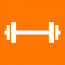 128px TrainerBooked TrainerBooked
 Reads clearly at 16px
The barbell, back where you wanted it, and still no checkmark. The long horizontal bar with heavy plates on each end is the most legible version of this shape at tab size.
Files: trainerbooked.ico and 512px PNG
SocialMapped
Option A
socialmapped.com
Growth chart inside a speech bubble
 16px
16px  32px
32px  48px
48px  64px
64px  128px SocialMapped SocialMapped
 Reads clearly at 16px
Says social and strategy in one shape. The speech bubble is the social half, the rising bars are the strategy half. My pick of the three.
Files: socialmapped-a.ico and 512px PNG

SocialMapped
Option B
socialmapped.com
Rising bars with an upward arrow
 16px
16px  32px
32px  48px
48px  64px
64px  128px SocialMapped SocialMapped
 Reads clearly at 16px
The clearest of the three at 16px, because it is one simple ascending shape. The tradeoff is that it reads as analytics generally, not social media specifically.
Files: socialmapped-b.ico and 512px PNG

SocialMapped
Option C
socialmapped.com
Two speech bubbles with a heart
 16px
16px  32px
32px  48px
48px  64px
64px  128px SocialMapped SocialMapped
 Readable, loses detail
The most obviously social of the three, and the warmest. The second bubble behind it gets thin below about 24px, so at true tab size it reads as one bubble with a heart.
Files: socialmapped-c.ico and 512px PNG

Taste Boulder
Option A, mountain between
tasteboulder.com
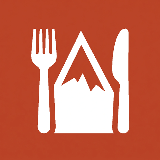
Fork, mountain peak, knife
 16px
16px  32px
32px  48px
48px  64px
64px 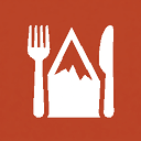 128px Taste Boulder Taste Boulder
 Readable, loses detail
The mountain sits between the utensils at the same height, so all three shapes stay separate. Busier than the plain fork and knife, but the Boulder half is unmistakable.
Files: tasteboulder-a.ico and 512px PNG
Taste Boulder
Option B, mountain behind
tasteboulder.com
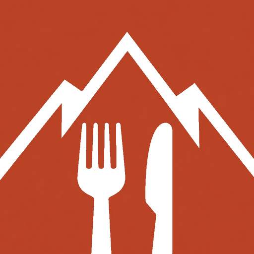
Fork and knife over a mountain range
 16px
16px  32px
32px  48px
48px  64px
64px  128px Taste Boulder Taste Boulder
 Readable, loses detail
More dramatic, and the mountains fill the square better. The utensils overlap the peaks, so at 16px the silhouettes start to merge into each other more than in Option A.
Files: tasteboulder-b.ico and 512px PNG
New to Boulder
newtoboulder.com
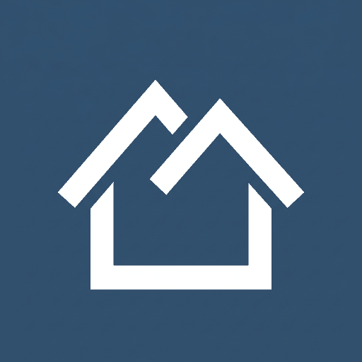
Flatirons roofline house on slate
 16px
16px  32px
32px  48px
48px  64px
64px  128px New to Boulder New to Boulder
 Readable, loses detail
Unchanged from the last round. The house outline survives, the twin peaks mostly do. Slate is still the quietest background here, so it recedes next to the pink and orange.
Files: newtoboulder.ico and 512px PNG
What the test keeps showing. Letters and single bold silhouettes win. The AT and the barbell are safe at any size. Anything built from two objects that touch each other loses definition the moment it drops below about 24 pixels, which is why the mountain-behind version of Taste Boulder is riskier than the mountain-between one.
Still open. Which SocialMapped option, and which Taste Boulder arrangement. New to Boulder may want a brighter background than slate.
Nothing here is deployed. These are drafts. No live site's favicon has been changed. Say the word and I'll wire your picks into each site's head tag.
Generated 2026-07-25 with Gemini 3.1 Flash Image. Companion page: Favicon Chooser v2, the hand-built SVG versions.